| Author | Thread |
Comments Made During the Challenge  |
|
|
04/13/2004 02:08:30 PM |
| I like what you were attempting. |
|
 Photographer found comment helpful. Photographer found comment helpful. |
|
|
04/11/2004 01:20:46 AM |
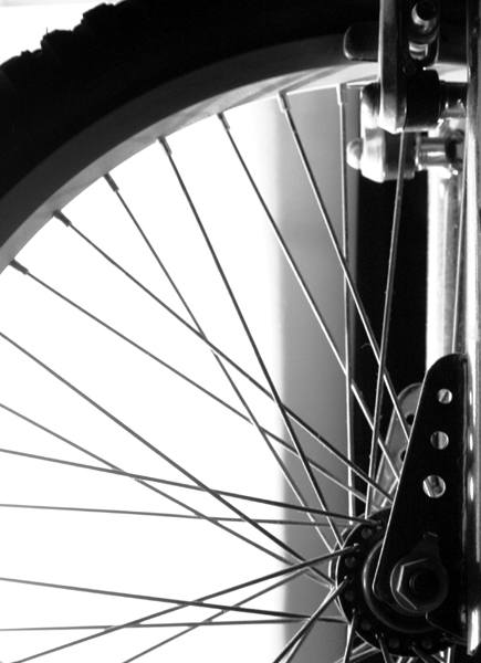
| I like it, but I would have liked it better without the washed out background -- it is just too distracting. |
|
| Photographer found comment helpful. |
|
|
04/10/2004 06:01:03 AM |
| clean shot. I like it, good contrast and sharpness. |
|
| Photographer found comment helpful. |
|
|
04/08/2004 11:06:27 PM |
| This is much more elegant than the other one (got space?) |
|
| Photographer found comment helpful. |
|
|
04/08/2004 03:15:33 AM |
| A bit more attention to the background would help. But I like the composition. |
|
| Photographer found comment helpful. |
|
|
04/07/2004 08:30:26 PM |
| It's not sharp enough... i like the approach in black and white... i am not sure i fancy that much the composition as it's kind of unballanced... and I do not understand the title. |
|
| Photographer found comment helpful. |
|
|
04/07/2004 02:13:20 PM |
| lol love the title.....heeheeh |
|
| Photographer found comment helpful. |
|
|
04/07/2004 01:05:28 PM |
| Excellent crop and very nice in b/w. The vertical shadow is perhaps a bit too dominant/sharp? Best bicycle wheel so far.. |
|
| Photographer found comment helpful. |
|
|
04/07/2004 06:58:25 AM |
| Use litle more USM then this image would have better. |
|
| Photographer found comment helpful. |
Home -
Challenges -
Community -
League -
Photos -
Cameras -
Lenses -
Learn -
Help -
Terms of Use -
Privacy -
Top ^
DPChallenge, and website content and design, Copyright © 2001-2025 Challenging Technologies, LLC.
All digital photo copyrights belong to the photographers and may not be used without permission.
Current Server Time: 03/11/2025 02:12:38 PM EDT.