| Author | Thread |
Comments Made During the Challenge  |
|
|
05/24/2008 10:08:31 PM |
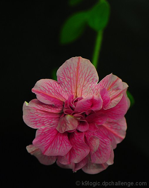
| Cute. I like how you had the stem fill the upper space, giving a reason for the flower to be in the lower half. |
|
 Photographer found comment helpful. Photographer found comment helpful. |
|
|
05/23/2008 03:11:00 PM |
| I think having a lighter backgroud would have helped bring out the pink more. |
|
| Photographer found comment helpful. |
|
|
05/22/2008 10:12:14 PM |
| Such a pretty flower :o) Seems like the petals are a bit dark, tho. Maybe just a bit more lighting? But I love the green stem in the background; it just finishes the whole image! |
|
| Photographer found comment helpful. |
|
|
05/22/2008 10:00:24 PM |
| Nice macro and good title. I do wish there was a bit more light on the flower. The white areas look a bit...grayish. |
|
| Photographer found comment helpful. |
|
|
05/21/2008 06:00:49 PM |
| The stem is pretty distracting |
|
| Photographer found comment helpful. |
|
|
05/21/2008 02:18:20 PM |
| cliche, green is distracting, underexposed.... but fitting 6 |
|
| Photographer found comment helpful. |
Home -
Challenges -
Community -
League -
Photos -
Cameras -
Lenses -
Learn -
Help -
Terms of Use -
Privacy -
Top ^
DPChallenge, and website content and design, Copyright © 2001-2025 Challenging Technologies, LLC.
All digital photo copyrights belong to the photographers and may not be used without permission.
Current Server Time: 03/11/2025 02:22:10 PM EDT.