| Author | Thread |
|
|
05/24/2005 10:55:07 PM |
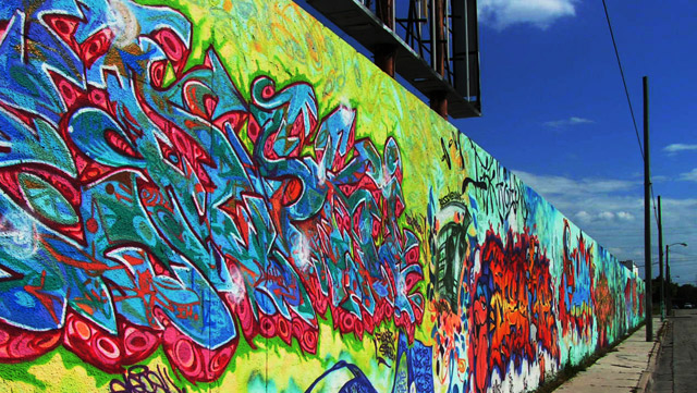
| as a graphiti artist... i must say you captured a picture of some really great graphiti. Excellent colours. |
|
Comments Made During the Challenge  |
|
|
04/09/2004 11:38:27 AM |
| Nice colors - these are not bad artists. |
|
 Photographer found comment helpful. Photographer found comment helpful. |
|
|
04/07/2004 11:25:03 AM |
|
|
|
04/05/2004 08:26:41 PM |
| Nice colors in your shot. All the lines and colors in the artwork do appear somewhat chaotic and frenzied. I think I would have preferred this shot with only the artwork showing....not the street items as well. I'm not sure how that would go with the rules, however. Still, nice find for the challenge. |
|
| Photographer found comment helpful. |
|
|
04/05/2004 02:48:52 PM |
| I woulfd like to have seen more of the wall, and less of the sky and the hoarding above. Nevertheless it is good. The colours are bright and the perspective is well caught. |
|
| Photographer found comment helpful. |
|
|
04/05/2004 05:13:19 AM |
| Your picture is really good, it meets the challenge very well. To my eye it looks a bit grainy but sometimes that can't be helped. |
|
| Photographer found comment helpful. |
|
|
04/05/2004 04:16:49 AM |
| It looks very deliberate to me. It does have a "riot" of colors though. Get it? The telephone poles don't add to the composition and might have been avoided if a different angle had been used or some cropping. Aligning the bottom edge of the fence with the bottom edge of the frame might have increased the feeling of displacement. |
|
| Photographer found comment helpful. |
|
|
04/05/2004 03:25:51 AM |
| Nice shot of chaos, but the pole on the right is distracting. Maybe crop just to the left of it and then clone out the overhead wire. Blue looks a tad oversatured in the sky, but it certainly helps bring out the colour in the wall |
|
| Photographer found comment helpful. |
Home -
Challenges -
Community -
League -
Photos -
Cameras -
Lenses -
Learn -
Help -
Terms of Use -
Privacy -
Top ^
DPChallenge, and website content and design, Copyright © 2001-2025 Challenging Technologies, LLC.
All digital photo copyrights belong to the photographers and may not be used without permission.
Current Server Time: 03/12/2025 02:31:53 PM EDT.