| Author | Thread |
|
|
06/06/2008 11:03:16 AM |
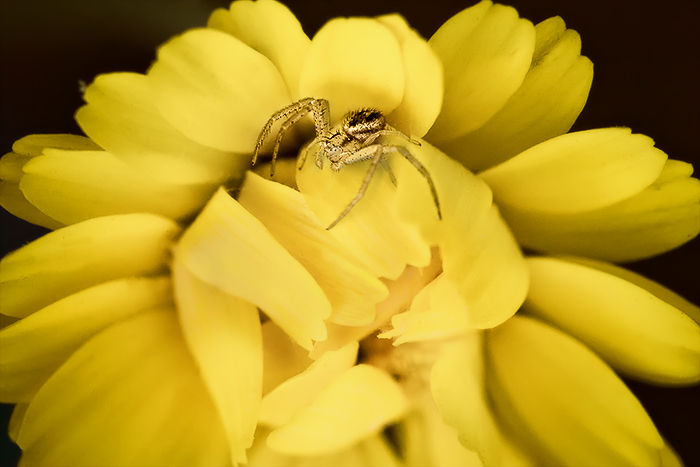
| Increasing the contrast really helped make the spider pop off the yellow flower more (you can really make out some nice details on the spider). The original had some flat contrasts and some tones. The PP helped increase the visual appeal by increasing the contrast between the two main subjects and the tones are richer. Darkening the background behind the flower also helps it to pop visually. Hmmm, tis a shame that you could not ask the spider to pose in a different position - if the spider's direction was flipped the other way the orientation/direction of the spider's legs would nicely mimic the orientation/direction of the center pedals. |
|
 Photographer found comment helpful. Photographer found comment helpful. |
|
|
05/31/2008 11:51:52 PM |
 yanko, just to be contrary (what else is new) yanko, just to be contrary (what else is new)
if it was mine, I'd really zero in on that beautiful spider.
I checked it out on my screen, and while at this resolution
there aren't the pixels to do it justice, think about looking
at just the spider and the middle of the flower - if the original
has the pixels.
In any event, it's a gorgeous find. |
|
| Photographer found comment helpful. |
|
|
05/31/2008 10:11:21 PM |
| I like the way the BG disappears in the edited version and I love the "feel" of this one much more. The original was a hair warm on the flower for my taste and I do like the softening of the yellow quite a bit, it makes the spider, who I assume is the star of this photograph, stand out much much better. :) |
|
| Photographer found comment helpful. |
|
|
05/31/2008 07:03:08 PM |
| i love the original and the edit .. subtle yet effective difference .. i would'v been tempted to keep the spider's web at the bottom of the image that i can see in the original, but cant in the edited version ... just my humble opinion .. and very humble, when considering i'm saying that to one of dpc's greats .. !!..:) |
|
| Photographer found comment helpful. |
|
|
05/31/2008 04:25:03 PM |
| hmmmm....I agree that the original needs more contrast, but I'm not sure I like the edit, either. I love the shot, btw, and I like how the increased contrast gives the image depth. I think my problem is the color shift to a cooler yellow. I think I preferred the slightly warmer, more orangey yellow. Just my opinion, though. |
|
| Photographer found comment helpful. |
Home -
Challenges -
Community -
League -
Photos -
Cameras -
Lenses -
Learn -
Help -
Terms of Use -
Privacy -
Top ^
DPChallenge, and website content and design, Copyright © 2001-2025 Challenging Technologies, LLC.
All digital photo copyrights belong to the photographers and may not be used without permission.
Current Server Time: 03/14/2025 01:37:53 AM EDT.