| Author | Thread |
|
|
06/01/2008 11:58:21 PM |
| Very interesting. This is a remarkable transformation. I am not sure I could name the genera you reached in the after shot. |
|
 Photographer found comment helpful. Photographer found comment helpful. |
|
|
06/01/2008 11:01:10 PM |
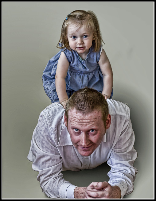
| Your focus is great. Did you use a Lucasarts Filter on this? It feels very metallic to me. This is, perhaps, what happened to the skin on the man in the photo? Your extraction of the people from the BG is phenomenal. |
|
| Photographer found comment helpful. |
|
|
06/01/2008 09:12:21 PM |
| You did a good job cleaning up the BG but I think you should have also cleaned up the face some too. Not that its a bad picture it would just be a better picture. |
|
| Photographer found comment helpful. |
|
|
06/01/2008 08:16:05 PM |
did you tell us what editing you did?!? :)
I like it alot. love that you got rid of the old background. what an adorable baby girl! |
|
| Photographer found comment helpful. |
|
|
06/01/2008 06:40:22 PM |
I like the background but I'm not a fan of highlight/shadow in PS because I think it's over-used in general... but I think you did an excellent job in the before/after which is the whole idea behind this. ; )
love |
|
| Photographer found comment helpful. |
|
|
06/01/2008 05:31:56 PM |
Love it....makes me wonder why I bothered to buy white background paper. Oh. Right. I'm not that good at Photoshop.
Like the others, I'd watch it with the guy's skin. Not just his head, but the freckles on his arms, too. |
|
| Photographer found comment helpful. |
|
|
06/01/2008 05:00:48 PM |
| Nice work- the little girl especially...I agree w/Yanko on the details of Dad's face :) |
|
| Photographer found comment helpful. |
|
|
06/01/2008 05:00:22 PM |
| BRILLIANT .. love how you've got rid of the background distractions .. i love your processing, which looks a lot like lucisart and can often give an unattractive appearance to a person's face .. i'd be toning it down on the guy tho.. it seems to be working on the little girl's face, probably coz she is so incredibly cute and it highlights the grubbyness .. which is particularly endearing .. :) |
|
| Photographer found comment helpful. |
|
|
06/01/2008 04:43:07 PM |
Very clean extraction of the background. I would tone down the detail level on the guys face as it doesn't look too flattering, IMO. The rest of the detail looks great. The shadow on the right side next to his shoulder seems somewhat out of place. Not sure why. Maybe because it's a little to roundish and should extent pass the frame? I assume you added it to give it more depth?
Message edited by author 2008-06-01 16:44:06. |
|
| Photographer found comment helpful. |
Home -
Challenges -
Community -
League -
Photos -
Cameras -
Lenses -
Learn -
Help -
Terms of Use -
Privacy -
Top ^
DPChallenge, and website content and design, Copyright © 2001-2025 Challenging Technologies, LLC.
All digital photo copyrights belong to the photographers and may not be used without permission.
Current Server Time: 03/14/2025 01:39:37 AM EDT.