Tweak to global saturation in RAW and contrast (of course!), USM, as well as crop to 16:9.
Used onboard flash at beginning of exposure, not sure if it did anything, though. I'm new to lighting shots.
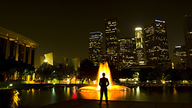
Actually took this photo as a last-minute "Night Sky" entry, but unexpected traffic took over, and by the time I had shot this rollover had occurred. Luckily, I think this shot is better for this challenge anyway, as LA is distinctly lacking in an interesting night sky. It's the things below it that count :P
Also interesting to note an earlier version of this photo with a different model (this time it's me) was my rescinded submission to last month's Free Study. I still liked the photo a lot, so decided it worth my time to reshoot it.
Statistics
Place: 37 out of 294 Avg (all users): 6.1477 Avg (commenters): 5.6667 Avg (participants): 6.0921 Avg (non-participants): 6.1900 Views since voting: 1435 Views during voting: 274 Votes: 176 Comments: 9 Favorites: 0
At first view the only part in my opinion that is high contrast is the man and the fountain. There is an overall extremely present medium tone throughout the entire image and medium is not a contrast. Least not to me.
Overall it is a nice image, though the slant of the buildings and the unbalanced weight really throws me off. Also, the orange, yellow, white of the fountain are too separated, as if levels where pushed hard to really make them stand out more.
I enjoy this idea, but believe it could have been done better. Maybe a different camera position, whereas only the tall multi-lighted/window buildings in the cluster are directly behind the fountain which is directly behind the figure? The figure also may be standing more towards the corner of the pad there. With that aspect it may make it easier to get a more uniform shape to the buildings, though without the proper tools they will slant, but if they slanted into each other other than leaning on one side I believe it would have really enhanced the image.
Also to keep the tall height aspect of the buildings a portrait crop would be much more beneficial. To me this is way to wide, and if the portrait crop was used it would have allowed for a greater 'contrast' to come through and thus I believe would have given this image a higher score possibility.
The idea was fantastic, but the left and right of your crop was distracting and cumbersome for me.
If there was a way to just see the city scape, even up to the Disney Auditorium, and cropped away the buildings that didn't do anything for the image, and kept the same idea going, I think your image would of done better.
I really like this idea, and the picture you took is really cool. It is a little busy though, I wonder if you could play with the perspective a little. If you could get the fountain to appear larger and maybe limit the background to just the skyscrapers, possibly by shooting from a lower angle, that might give the picture some more focus. Don't know if you could get such a shot from that location, but it might be worth a try. Congratualtions on a new PB!
In response to your thread asking for comments, I would've scored this a 6 or 7, which is a good score from me. I like the yellow color, the skyline, and the pure silhouette. The skyline's seems a little soft, so try F/8 or F/11 next time. Also, and this just my preference, I like photos where the subject's either dead center or well away from it. Here, the composition feels like there's too much on one side or the other.
Lots of contrast in the middle with the neon fountain and the man pissing in the pond, but not much elsewhere. Maybe a little overtime could help the architects save up for a plumb bob...