| Author | Thread |
|
|
06/06/2008 04:08:03 AM |
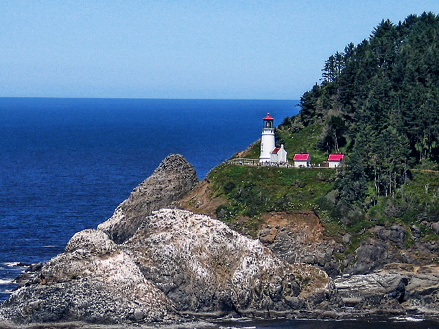
| I like the added colour, the houses now pop out of the photo. I would have to agree on the sharpening. Try a history brush set to about 20% 20%, set it to the edit right before the sharpening, and pass it over the trees and rocks until it is faded back to a little bit of blur. Art told me about that nifty little tool :) |
|
 Photographer found comment helpful. Photographer found comment helpful. |
|
|
06/05/2008 06:22:42 PM |
| AHH- the coast of Maine...great shot, Jeannie- the edit is very nice but a bit "grainy" on my screen- do love the colors ! Nothing like the rocky coast of Maine :) |
|
| Photographer found comment helpful. |
|
|
06/05/2008 04:29:46 PM |
| Nice! The colors and contrast are a big improvement. It might be a bit sharp. I'm no sharpening genius, but on something like this, you might try sharpening it, then fade it to about 80%, to fade the halos and speckles a bit. |
|
| Photographer found comment helpful. |
|
|
06/05/2008 10:57:25 AM |
I like the richer colors. I was going to suggest that the horizon wasn't level, but it is. I guess it is just an optical illusion. It appears to me that the horizon droop down toward the mountain... but it doesn't. I wonder if this is a normal illusion in images with such an imbalance in weight side to side or with such a lovely strong diagonal through the image. Oh well, it is a very beautiful scene well presented.
Message edited by author 2008-06-05 10:58:32. |
|
| Photographer found comment helpful. |
|
|
06/05/2008 02:37:03 AM |
| It is much nicer in person. |
|
| Photographer found comment helpful. |
|
|
06/04/2008 11:32:05 PM |
This is a superb vacation post card sort of shot. I like the finished image much better for color saturation, however, it seems just a little sharpish in the rocks area to me. Is "sharpish" a word, or did I just make that up? There are a lot of people around the tower.
Wish I could see this place in person. |
|
| Photographer found comment helpful. |
|
|
06/04/2008 11:12:56 PM |
| Great seascape composition. I like the 50/50 diagonal created between the land and sea. This would be an awesome sunset shot, I think. |
|
| Photographer found comment helpful. |
Home -
Challenges -
Community -
League -
Photos -
Cameras -
Lenses -
Learn -
Help -
Terms of Use -
Privacy -
Top ^
DPChallenge, and website content and design, Copyright © 2001-2025 Challenging Technologies, LLC.
All digital photo copyrights belong to the photographers and may not be used without permission.
Current Server Time: 03/14/2025 01:37:45 AM EDT.