| Author | Thread |
|
|
07/04/2008 05:32:00 PM |
Critique Club Review:
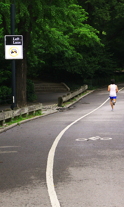
Color Saturation and Hue: Colors are realistic and believeable. Skin tones are within normal range.
Brightness and contrast: The sign on the left of the image is blown-out and overly bright. Other than that, the other highlight areas work well.
What I see here is a nice image with a few problems. The sign really competes for attention. The brightness commands the eye to come to it. What happens when I look at this image is that my eye tries to follow the line, but winds up getting yanked away by the sign, and it follows the road less travelled, right up the steps. The steps themselves are a pretty strong competitor to your line. Though the runner is on the line, he is rather small in scale in comparison, and facing away which further minimizes the attention that he can command.
I would really like to see this one done again, with the runner coming towards the camera, running right on the line, and the camera moved or photo cropped so that the so the distractions are minimized by the elimination of the sign and the tree trunk. |
|
Comments Made During the Challenge  |
|
|
06/26/2008 12:09:33 PM |
| I really like this entry, though with Advanced editing, I'd have liked to at least seen that sign burned some so as not to be so distracting. Maybe even a tilted crop.......just musing....good composition. 6 |
|
 Photographer found comment helpful. Photographer found comment helpful. |
|
|
06/23/2008 04:16:38 PM |
| not the most interesting shot but the composition is good. |
|
| Photographer found comment helpful. |
|
|
06/23/2008 03:01:08 PM |
|
| Photographer found comment helpful. |
|
|
06/23/2008 02:23:49 AM |
| I think I would have snapped from a lower vantage point |
|
| Photographer found comment helpful. |
Home -
Challenges -
Community -
League -
Photos -
Cameras -
Lenses -
Learn -
Help -
Terms of Use -
Privacy -
Top ^
DPChallenge, and website content and design, Copyright © 2001-2025 Challenging Technologies, LLC.
All digital photo copyrights belong to the photographers and may not be used without permission.
Current Server Time: 03/16/2025 06:18:35 PM EDT.