| Author | Thread |
Comments Made During the Challenge  |
|
|
10/13/2002 10:52:00 AM |
Composition: Subject Placement, Cropping, Background6,
Technical: Focus, Exposure, Lighting, Processing8,
Appeal: Is it Interesting, Motivating, Etc.? 3,
Total Averaged Rating6. Autool
|
|
|
|
10/12/2002 01:21:00 AM |
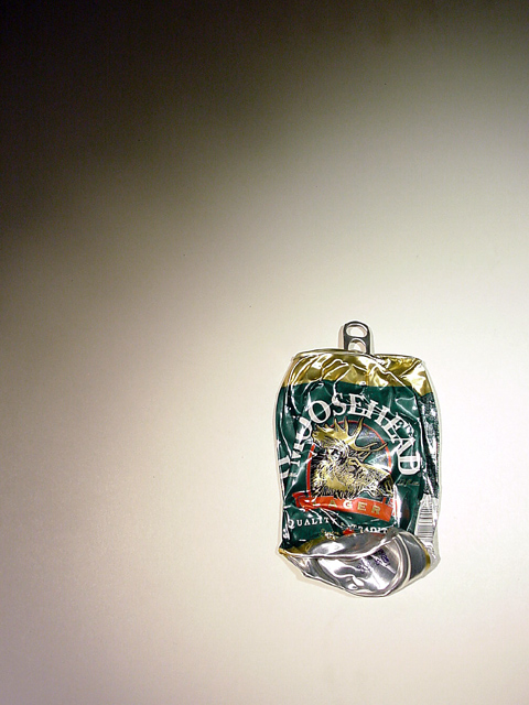
| the lighting is what makes this photo interesting. 7 |
|
|
|
10/10/2002 02:50:00 PM |
| great lighting. so far I have you in that "gray area", above average,nice pic, but? Just doesn't grab me. |
|
|
|
10/10/2002 12:45:00 PM |
| I like your use of negative space, and the texture on the can looks good (but maybe a bit overexposed). - Konador |
|
|
|
10/10/2002 10:12:00 AM |
| Well taken picture. I like the lighting effect at the top. |
|
|
|
10/08/2002 04:26:00 PM |
| Nice concentration on the single object... |
|
|
|
10/08/2002 09:55:00 AM |
| I like the use of shadow to fill up space but did u drik that first and how did u smash it? 4 Mags Coyote |
|
|
|
10/08/2002 01:01:00 AM |
| Good composition. Lighting is good too except that I find the reflective glares in the "crumples" a little distracting. Nice photo. |
|
|
|
10/07/2002 04:25:00 PM |
| Nice, very nice - deserves to do well |
|
|
|
10/07/2002 12:15:00 PM |
| I like the lighting and use of negative space. It looks almost like a painting. DPz |
|
|
|
10/07/2002 11:15:00 AM |
| I love the background lighting, in fact I prefer it to the lighting on the main subject. 6 |
|
|
|
10/07/2002 10:13:00 AM |
| The dark shadow top left is really distracting. Perhaps if it could have been shadowed like the bottom left corner it would look better. Good idea. |
|
|
|
10/07/2002 09:13:00 AM |
Photography comment: I would have moved in a BIT closer
non photography comment: heh heh...good ol' mooshead. :) |
|
Home -
Challenges -
Community -
League -
Photos -
Cameras -
Lenses -
Learn -
Help -
Terms of Use -
Privacy -
Top ^
DPChallenge, and website content and design, Copyright © 2001-2025 Challenging Technologies, LLC.
All digital photo copyrights belong to the photographers and may not be used without permission.
Current Server Time: 03/12/2025 11:45:34 AM EDT.