| Author | Thread |
Comments Made During the Challenge  |
|
|
07/08/2008 08:57:44 PM |
|
 Photographer found comment helpful. Photographer found comment helpful. |
|
|
07/08/2008 05:15:49 PM |
| FANTASTIC!!!! One of the best in this challenge. I would be surprised if it wasn't in top 20. |
|
| Photographer found comment helpful. |
|
|
07/06/2008 10:17:25 PM |
|
| Photographer found comment helpful. |
|
|
07/05/2008 04:20:58 PM |
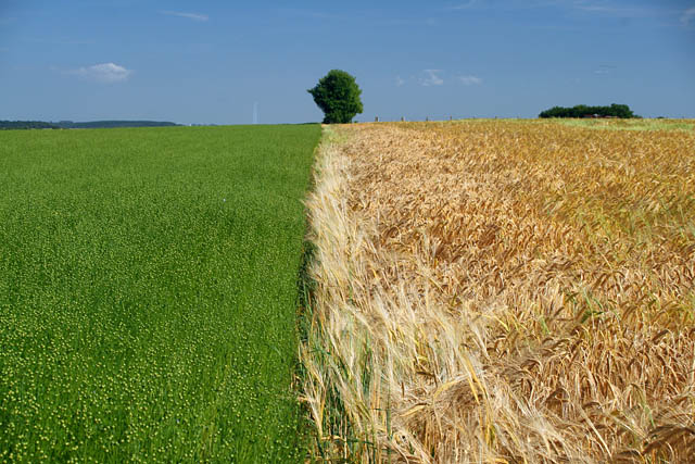
| this is so nice, the composition is very thoughtful. i would even suggest taking the photo a touch lower, so the horizon is slightly lower, to suggest the aim is almost within the line...then would lead you to the tree instead of the tree first. 7 |
|
| Photographer found comment helpful. |
|
|
07/05/2008 10:10:10 AM |
| the harshness of the lines and the tree at the horizon as a stopping point does not really work for me - i think i see what you are trying to do - showing the contrasting colors and textures of new versus ready for harvest, but i just think the composition really segments the shot too much for me |
|
| Photographer found comment helpful. |
|
|
07/05/2008 03:58:56 AM |
| Inspired by Charlie Waite, perhaps? ;) It's a good attempt. Keep it up! :) |
|
| Photographer found comment helpful. |
|
|
07/04/2008 08:38:40 AM |
| Close, but doesn't quite work compositionally. Great texture and color contrast between the grass and grain. The tree should have been either more in focus or left out. Also, the dividing line should be either dead center or at the 1/3 point horizontally. |
|
| Photographer found comment helpful. |
|
|
07/02/2008 03:18:54 PM |
| neat idea! I love the contrast! |
|
| Photographer found comment helpful. |
|
|
07/02/2008 02:49:57 PM |
| Moving to the left or the right would create a strong diagonal which may have created a more interesting shot. |
|
| Photographer found comment helpful. |
Home -
Challenges -
Community -
League -
Photos -
Cameras -
Lenses -
Learn -
Help -
Terms of Use -
Privacy -
Top ^
DPChallenge, and website content and design, Copyright © 2001-2025 Challenging Technologies, LLC.
All digital photo copyrights belong to the photographers and may not be used without permission.
Current Server Time: 03/16/2025 02:44:09 PM EDT.