| Author | Thread |
|
|
10/21/2002 07:32:00 PM |
| thanks to everyone for your comments. I learn alot from your input. |
|
Comments Made During the Challenge  |
|
|
10/19/2002 03:50:00 PM |
| only 96k utilised - the quality factor could have been increased by another 50% upto the 150k maximun |
|
|
|
10/19/2002 11:06:00 AM |
Composition: Subject Placement, Cropping, Background7,
Technical: Focus, Exposure, Lighting, Processing6,
Appeal: Is it Interesting, Motivating, Etc.? 5,
Total Averaged Rating6. Autool
|
|
|
|
10/18/2002 10:02:00 PM |
| great composition and shot...the message is very clear. |
|
|
|
10/18/2002 02:30:00 AM |
| Good composition, the graininess adds to it. |
|
|
|
10/17/2002 04:54:00 PM |
| Composition: Subject Placement, Cropping, Background 7, Technical: Focus, Exposure, Lighting, Processing 5 , Appeal: Is it Interesting, Motivating, Etc.? 5 , Total Averaged Rating 6 . smshats |
|
|
|
10/17/2002 03:26:00 PM |
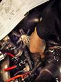
Very good idea. The guys shirt tells me he has won many times.
Vote 9
Sonifo |
|
|
|
10/17/2002 12:02:00 AM |
| For some reason the picture does not appear very sharp |
|
|
|
10/16/2002 08:22:00 PM |
| sharpened a little too much |
|
|
|
10/16/2002 05:11:00 PM |
| Is that a pinochle deck? I do like the shot btw. |
|
|
|
10/16/2002 05:08:00 PM |
| I like this. I like that the bet on the table included somebody's house and watch . . .not just cash. You obviously put a lot of thought into the concept and your time and effort shows in the finished product. Very nice. |
|
|
|
10/16/2002 10:09:00 AM |
| I like the concept of the photo, but think the lighting is a bit off. |
|
|
|
10/16/2002 09:06:00 AM |
Nicely done, and it fits the theme well too. 7/10
|
|
|
|
10/15/2002 07:56:00 PM |
| Good color mixture and use of materials. Very crispand clear photo |
|
|
|
10/15/2002 11:30:00 AM |
| What an original great idea for a photo. Would love for u to have set up some other players and get partial parts of their cards but a beautiful shot 7 Mags Coyote |
|
|
|
10/15/2002 12:19:00 AM |
| The hand looks like its at a strange angle. |
|
|
|
10/14/2002 10:30:00 PM |
| interesting idea but the set up looks a bit too "set up" |
|
|
|
10/14/2002 10:22:00 PM |
|
|
|
10/14/2002 05:32:00 PM |
| Reminds me of an album cover, but can't remember whose (Blue Oyster cult perhaps?) |
|
|
|
10/14/2002 03:53:00 PM |
| Dang! Don't you have a lotta dough handy for just a pic... Ok shot, but it would have been more effective with other players involved. |
|
|
|
10/14/2002 03:32:00 PM |
| A bit unoriginal, yet well executed shot. It's a bit static though and the framing could be less centered and a bit closer to add to the composition. Nice effort. 6/10 |
|
|
|
10/14/2002 02:38:00 PM |
| The focus seems a little off to me, but that may be my monitor. I like the contrast of the colors on the blue background. The hand looks "staged" to me, not a natural position, but I understand that it may jsut be the perspective. karmat |
|
|
|
10/14/2002 10:21:00 AM |
| Just way to blatant of a statement and it is too pedestrian of an effort to make it work. |
|
|
|
10/14/2002 04:06:00 AM |
| Silver dollars. Nice shot, good title too. Good luck-Justine |
|
Home -
Challenges -
Community -
League -
Photos -
Cameras -
Lenses -
Learn -
Help -
Terms of Use -
Privacy -
Top ^
DPChallenge, and website content and design, Copyright © 2001-2025 Challenging Technologies, LLC.
All digital photo copyrights belong to the photographers and may not be used without permission.
Current Server Time: 03/10/2025 06:12:36 PM EDT.