CRITIQUE CLUB CRITIQUE
by karmat
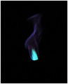
Compositionally, I really like this. The colors are as much the subject as the wick, and they interact and work together nicely.
Technically, I think the focus is good, and the colors are awesome.
Overall, to me, it does convey a sense of "heat" and it is a very good abstract. I suspect, though, the sub-5 score is largely due to the fact that it is abstract, and many people may not have taken (or had) the time to really look at it and realize what it was. Also, the white area in the bottom right is very distinguishable and may have captured people's attention quickly. Since it is not in focus, that could have caused some to feel that the rest was unfocused as well.
Best to you in future challenges.
Karma |