| Author | Thread |
Comments Made During the Challenge  |
|
|
04/19/2004 06:49:35 AM |
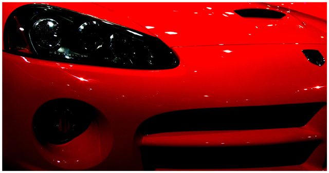
| Does nothing for me, it's the front of a car at a motor show. |
|
|
|
04/18/2004 10:18:04 PM |
|
|
|
04/18/2004 01:37:13 PM |
| The beautifully polished metal comes across well, but at the same time catches distracting highlights. |
|
|
|
04/18/2004 12:15:38 PM |
| This works really well if you know what a Vipor is. I do. Nice shot! |
|
|
|
04/17/2004 12:57:48 AM |
| Yes, it is a poweful car, but it doesn't see to represent strength, more beauty I would say. Glare spots are annoying but nothing you can do. seems a bit dark. |
|
|
|
04/16/2004 01:58:33 PM |
| Lots of lights reflecting on the paint makes lots of distractions... |
|
|
|
04/15/2004 12:34:48 PM |
|
|
|
04/15/2004 11:07:10 AM |
| Hood symbol should be able to see that is a Dodge, but it looks simply black |
|
|
|
04/15/2004 09:43:34 AM |
| A bit too much contrast for my taste. Many areas of the pic are poorly lit. Any reason why you chose to frame the way you did? Such a tight crop reduces the image to abstract shapes of light and dark. Many will assume it is a car from the headlight or the finish of the paintjob, but does it truly depict strength to me? Not really. Maybe if I were a car enthusiast or Dodge Viper fan, it would be easily recognizable. To everyone else, sorry to say, "it's just a car." |
|
|
|
04/14/2004 03:34:52 PM |
| too many lights are being reflected in the car's paint. the bottom of the pic is too much in shadow. the emblem, a key item that might say 'viper' and infer strength, is too dark. too close up too i think. |
|
|
|
04/14/2004 01:21:28 PM |
| Nice colors. The myriad of reflections on the hood are a little distracting. I do like the star reflections on the forward facing planes. |
|
|
|
04/14/2004 12:03:10 PM |
| I'd like to see more of the car... |
|
|
|
04/14/2004 07:06:23 AM |
| May be a little "out of contest"? Strength is a very wide subject, and chosing the right title helps a lot in those cases... "Power of red" or "The power of mechanic" may had make the photo + title more "in place" and raise the final score. Some times details are very important. |
|
|
|
04/14/2004 12:12:47 AM |
| *swoon* hahaha nice pic ( shiny) |
|
Home -
Challenges -
Community -
League -
Photos -
Cameras -
Lenses -
Learn -
Help -
Terms of Use -
Privacy -
Top ^
DPChallenge, and website content and design, Copyright © 2001-2025 Challenging Technologies, LLC.
All digital photo copyrights belong to the photographers and may not be used without permission.
Current Server Time: 03/12/2025 07:14:58 PM EDT.