| Author | Thread |
|
|
07/30/2008 06:20:53 PM |
Critique Club Review:
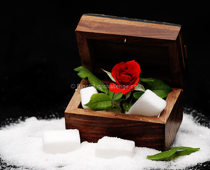
Color Saturation and Hue: Colors are vivid, the red is on the edge of over saturation. Hues are natural.
Brightness and Contrast: Contrast may be a little high. The some of the whites in the sugar area have lost detail and are featureless.
Focus and depth of field: Focus is nice and sharp, but maybe a little shallow. Things start to soften by the time you get to the back of the box, and the sugar at the left of the box is very soft.
The compostion here is interesting. I would have liked it a bit better with less saturation, and not so much contrast. A little different lighting angle, not so much top down, may have helped give the sugar some definition also.
|
|
 Photographer found comment helpful. Photographer found comment helpful. |
|
|
07/28/2008 03:08:19 AM |
| questa meritava di piú :) |
|
| Photographer found comment helpful. |
Comments Made During the Challenge  |
|
|
07/26/2008 06:50:30 PM |
| That was a tough meter, wasn't it? The sugar seems blown out, but I like the setup. |
|
| Photographer found comment helpful. |
|
|
07/24/2008 12:14:49 AM |
| I dont understand the title, but I like the shot. |
|
| Photographer found comment helpful. |
|
|
07/23/2008 01:22:39 AM |
| Love the colours, textures and composition |
|
| Photographer found comment helpful. |
Home -
Challenges -
Community -
League -
Photos -
Cameras -
Lenses -
Learn -
Help -
Terms of Use -
Privacy -
Top ^
DPChallenge, and website content and design, Copyright © 2001-2025 Challenging Technologies, LLC.
All digital photo copyrights belong to the photographers and may not be used without permission.
Current Server Time: 03/12/2025 03:12:35 AM EDT.