| Author | Thread |
Comments Made During the Challenge  |
|
|
10/20/2002 07:11:00 PM |
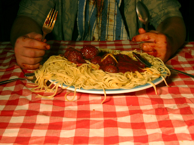
| A liitle too much table cloth in the fore ground |
|
|
|
10/20/2002 03:58:00 PM |
| this works well for gluttony ... but i wish we coulda seen more of the person than the table cloth 7-photosbyayme |
|
 Photographer found comment helpful. Photographer found comment helpful. |
|
|
10/20/2002 02:21:00 PM |
|
|
|
10/19/2002 11:45:00 PM |
|
|
|
10/18/2002 05:08:00 PM |
| I don't know if I'm on an "I hate on-camera flash" jag this week, but that's what lost points from me. The concept is goo, though, and I love the details like the spatter marks on his shirt, the crumpled tablecloth... |
|
|
|
10/18/2002 08:56:00 AM |
Composition: Subject Placement, Cropping, Background6,
Technical: Focus, Exposure, Lighting, Processing7,
Appeal: Is it Interesting, Motivating, Etc.? 6,
Total Averaged Rating6. Autool
|
|
| Photographer found comment helpful. |
|
|
10/17/2002 09:32:00 PM |
| poor centering - poor lighting, bad colorization, looks like full plate but bood on fork and hands and clothes. Not eye appealing |
|
|
|
10/17/2002 08:39:00 PM |
| Pass the parmesan please...looks good and almost looks like me when it comes to pasta. Good composition and dof. |
|
| Photographer found comment helpful. |
|
|
10/17/2002 06:56:00 PM |
| The picture is bright at the bottom and dark at the top,. |
|
|
|
10/16/2002 08:01:00 PM |
| Expresses the theme ok. It might be that it could have been composed more effectively with a different angle, different lighting. I am assuming it was staged to some extent where you might have some control. |
|
| Photographer found comment helpful. |
|
|
10/16/2002 06:08:00 PM |
| Perfectly gluttonous! The sauce all over the hands and "bib" -- gross but nice touch. |
|
|
|
10/16/2002 05:14:00 PM |
| I don't like the lighting on this one. |
|
|
|
10/15/2002 09:27:00 PM |
| Oh my God - and I used to like pasta. 6 JEM |
|
|
|
10/15/2002 06:12:00 AM |
| Damn, you're already a mess! Is this seconds or thirds? Great interpretation! |
|
| Photographer found comment helpful. |
|
|
10/15/2002 01:04:00 AM |
|
|
|
10/15/2002 12:06:00 AM |
I actually expect to see the head on the plate
|
|
|
|
10/14/2002 10:02:00 PM |
| great photo, could use a little more light. |
|
|
|
10/14/2002 09:14:00 PM |
| Pretty funny, you should have added some bread, dessert, etc. |
|
|
|
10/14/2002 09:03:00 PM |
| Composition: Subject Placement, Cropping, Background 7 , Technical: Focus, Exposure, Lighting, Processing 6, Appeal: Is it Interesting, Motivating, Etc.? 6 , Total Averaged Rating 6 . smshats |
|
| Photographer found comment helpful. |
|
|
10/14/2002 04:03:00 PM |
| Needs a bit more light. If his hands are that messy, I am glad you didn't show us his face! |
|
|
|
10/14/2002 03:43:00 PM |
| The things we do for DPChallenge !.. Although the sight is most certainly not pretty, the eye (mine anyway) wants to look up and is frustrated having to look at so much of the tablecloth. I shudder to think what a better framing would do to the picture :-) |
|
| Photographer found comment helpful. |
|
|
10/14/2002 03:32:00 PM |
| Damn, this is gross. Very well executed with the theme in mind. 8/10 |
|
|
|
10/14/2002 02:41:00 PM |
| Loved the lighting, composition and relevance to the theme. |
|
| Photographer found comment helpful. |
|
|
10/14/2002 01:51:00 PM |
| Good picture, but could've used a little more exposure to bring up the brightness. |
|
| Photographer found comment helpful. |
|
|
10/14/2002 12:35:00 PM |
| This is great. It reminds me of the movie 7. |
|
|
|
10/14/2002 11:06:00 AM |
| composition is great. this photo reminds me of the film "seven" and the fat bloke who pops! 9, fluffy |
|
| Photographer found comment helpful. |
|
|
10/14/2002 04:51:00 AM |
| Fun work. Your lighting is a little weak. Don't get me wrong....this is creative, fun, and good color!! Good luck. Justine |
|
| Photographer found comment helpful. |
Home -
Challenges -
Community -
League -
Photos -
Cameras -
Lenses -
Learn -
Help -
Terms of Use -
Privacy -
Top ^
DPChallenge, and website content and design, Copyright © 2001-2025 Challenging Technologies, LLC.
All digital photo copyrights belong to the photographers and may not be used without permission.
Current Server Time: 03/12/2025 12:30:32 PM EDT.