| Author | Thread |
Comments Made During the Challenge  |
|
|
10/20/2002 10:18:00 PM |
| good idea, but the broken pieces look too placed... |
|
|
|
10/18/2002 09:50:00 PM |
| Excellent. They look like two different pencils though? |
|
|
|
10/18/2002 11:08:00 AM |
| Good idea, but could have been a bit sharper I think. |
|
|
|
10/18/2002 06:43:00 AM |
|
|
|
10/18/2002 03:55:00 AM |
| very nice. tho the tinyest of bits blurry which takes away on some detail I feel but good!! =D |
|
|
|
10/17/2002 06:28:00 PM |
| i think the DOF is a drop to narrow for my taste here. I would like a little more of the pencil to be sharply in focus. good idea |
|
|
|
10/17/2002 09:13:00 AM |
Composition: Subject Placement, Cropping, Background7,
Technical: Focus, Exposure, Lighting, Processing5,
Appeal: Is it Interesting, Motivating, Etc.? 3,
Total Averaged Rating5. Autool
|
|
|
|
10/16/2002 07:27:00 PM |
| Composition is good. Use of b&w effective. It might have been a bit more effective if a little more of the splintered end had had better focus and then blurred out to the corner. The complete "white out" to the left seems a little too much, but that might be just me. You wouldn't want it too "busy". |
|
|
|
10/16/2002 06:09:00 PM |
| Interesting. I really want to read what' is written on the pencil. |
|
|
|
10/16/2002 05:53:00 PM |
|
|
|
10/16/2002 02:09:00 PM |
|
|
|
10/16/2002 11:44:00 AM |
| black & white shanked this beautiful idea out 4 Mags |
|
|
|
10/16/2002 06:30:00 AM |
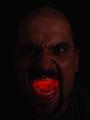
| excellent shot... the soft focus and the high key lighting seem to provide nice support of your wrath theme :) - setzler |
|
|
|
10/16/2002 05:20:00 AM |
|
|
|
10/15/2002 06:25:00 PM |
| plain, simple, and to the point. Great work |
|
|
|
10/15/2002 01:19:00 AM |
| Focus is a little bit soft (DOF too narrow) |
|
|
|
10/14/2002 09:08:00 PM |
| Could have been a good picutre. Is that a golf club? If so, you should have put on on putting green with a pissed player in the background. or something like that. |
|
|
|
10/14/2002 08:42:00 PM |
| Composition: Subject Placement, Cropping, Background 10, Technical: Focus, Exposure, Lighting, Processing 9 , Appeal: Is it Interesting, Motivating, Etc.?9 , Total Averaged Rating9 . smshats |
|
|
|
10/14/2002 08:31:00 PM |
| good idea, but it looks like it's two different pencils. |
|
|
|
10/14/2002 03:45:00 PM |
|
|
|
10/14/2002 02:46:00 PM |
|
|
|
10/14/2002 02:13:00 PM |
| A good visual pointer/metaphor, carefully thought out and effectively composed (although my brain keeps expecting to see something in that top right hand corner). |
|
|
|
10/14/2002 04:37:00 AM |
| Done that myself. Good luck. Justine |
|
|
|
10/14/2002 12:33:00 AM |
| Really nice textures, and I like your choice to have this image fading in and out of focus. I can see the emotion in this shot. |
|