| Photograph Information |
Photographer's Comments |
Challenge: Silhouettes (Advanced Editing I)
Collection: Portfolio
Camera: Sony DSC-F717
Location: My Room, Coral Springs, Fl
Date: Apr 17, 2004
Aperture: 3.5
ISO: 100
Shutter: 1/50
Galleries: Still Life, Studio
Date Uploaded: Apr 17, 2004
|
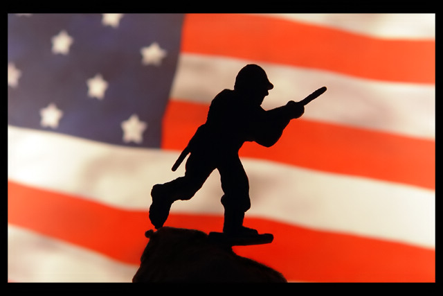
Printed out a pic of an american flag, taped it to my TV, and got a tube to hold the soldier on a rock in front of it. Stuck my camera on the tripod, and used a circular polarizer. (when i lit up the background, there were a few reflections on the toy.)
POST PROCESSING:
There were a few reflections on the soldier, so I cloned them out. And the rock was a had a few reflections from the back, (due to its shinyness) so I darkened it with the burn tool. Auto Levels, Border, and Resize. Oh yeah, ran through neat image.
....and all this was at 2am. |
| Author | Thread |
|
|
04/29/2004 05:05:40 PM |
Originally posted by mavrik:
Shooting the flag will always get a polar reaction. |
Especially in Iceland. |
|
 Photographer found comment helpful. Photographer found comment helpful. |
|
|
04/29/2004 04:59:36 PM |
Greetings from the Critique Club,
Hi Harrison, nice to meet you.
First things first: egillibsen's comment is his opinion, but a silly one. I think he gave you a 1 because it's an AMERICAN flag, not the Icelandic national flag. *shrug* Shooting the flag will always get a polar reaction. Oh well.
Thoughts - the toy part on bottom could have been cut off/removed so that we couldn't see how silly it looks as a toy. *shrug* Just a minor thing, but the diff between a 4.5 and a 6.5 is image quality and details, NOT in your idea, usually.
Given that this is a silhouette and the background is meant to look like something, I'd have preferred this bg be in focus and the subject be silhouetted but also sharp. The soft focus and partial overexposure on the left detracts from the image.
I don't like the thick border, but that's just my opinion. All borders are subjective and usually detract on dpc.
Mav |
|
| Photographer found comment helpful. |
Comments Made During the Challenge  |
|
|
04/25/2004 11:25:13 PM |
| Cute idea; well done except the flag is somewhat overexposed on the left. I think it might have been better without centering the soldier as well. |
|
| Photographer found comment helpful. |
|
|
04/25/2004 10:00:40 PM |
| Clever use of (what might be) inexpensive props to create an evocative image. |
|
| Photographer found comment helpful. |
|
|
04/25/2004 10:12:12 AM |
| Not much movement here because of the composition with the silhouette smack in the middle. Don't like DOF much: either have both the silhouette and the flag sharp, or have the flag much more out of focus. |
|
| Photographer found comment helpful. |
|
|
04/24/2004 07:53:01 PM |
| It stands for 1. Terrible idea. |
|
|
|
04/21/2004 10:37:55 PM |
| Very creative idea for this challenge. |
|
| Photographer found comment helpful. |
|
|
04/21/2004 11:11:04 AM |
Really this isn't a bad shot. It is just a bit fake looking. Know what I mean? maybe if you move the army guy to the right of left it would have a better feel to it.
Technically perfect. 6 |
|
| Photographer found comment helpful. |
|
|
04/20/2004 12:20:07 AM |
| Looks like a toy soldier; the framing is distracting (too thick on top and bottom). Because it's a toy soldier, his foot looks weird standing on...what? a board? I realize it's a piece of plastic but it distracts and gives away the image. |
|
| Photographer found comment helpful. |
|
|
04/19/2004 02:48:35 PM |
| Nice job, but soldier is too centered for my taste. |
|
| Photographer found comment helpful. |
|
|
04/19/2004 02:12:52 PM |
| I am not sure if this is suppose to be a parity or not. Either way it does not do a lot for me. |
|
| Photographer found comment helpful. |
Home -
Challenges -
Community -
League -
Photos -
Cameras -
Lenses -
Learn -
Help -
Terms of Use -
Privacy -
Top ^
DPChallenge, and website content and design, Copyright © 2001-2025 Challenging Technologies, LLC.
All digital photo copyrights belong to the photographers and may not be used without permission.
Current Server Time: 04/29/2025 04:19:28 PM EDT.