| Author | Thread |
|
|
10/25/2008 08:50:20 AM |
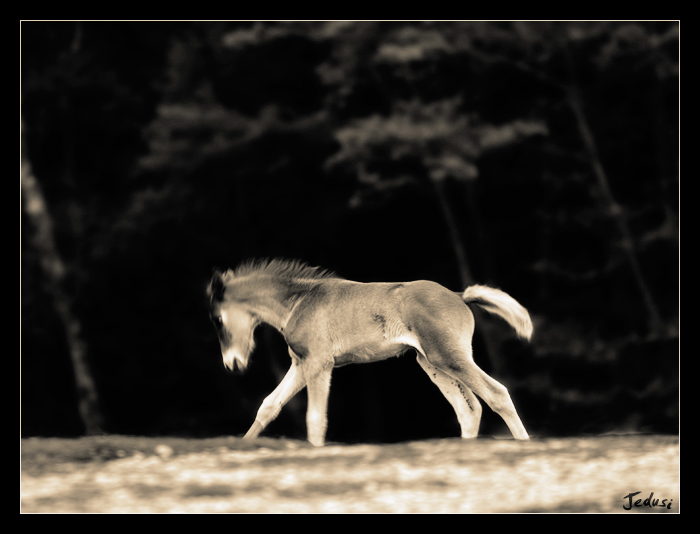
| Simple, clean, nice pose and energy from the colt. The foreground looks a bit odd to me, but can't really explain why - looks a bit fake/plastic maybe, though that's due to the DOF and/or processing I suppose. |
|
 Photographer found comment helpful. Photographer found comment helpful. |
|
|
10/25/2008 06:49:08 AM |
| I like the contrast between light and dark, and the sepia toning is nice. The composition seems a tad awkward, as if it needs to be perfectly centered, or cropped in a way that allows negetive space on one side or the other(these really are just nit picks though :)) |
|
| Photographer found comment helpful. |
Home -
Challenges -
Community -
League -
Photos -
Cameras -
Lenses -
Learn -
Help -
Terms of Use -
Privacy -
Top ^
DPChallenge, and website content and design, Copyright © 2001-2025 Challenging Technologies, LLC.
All digital photo copyrights belong to the photographers and may not be used without permission.
Current Server Time: 04/21/2025 11:13:06 PM EDT.