| Author | Thread |
Comments Made During the Challenge  |
|
|
10/19/2002 10:50:00 AM |
Composition: Subject Placement, Cropping, Background9,
Technical: Focus, Exposure, Lighting, Processing9,
Appeal: Is it Interesting, Motivating, Etc.? 7,
Total Averaged Rating8. Autool
|
|
|
|
10/17/2002 09:24:00 PM |
| Looks staged and unreal and unnatural. Lack of color. Has nothing to grab your eye |
|
|
|
10/16/2002 08:23:00 PM |
| I think more contrast would do this picture more justice |
|
|
|
10/16/2002 06:33:00 AM |
| I believe that a polarizer may help bring out the color in this photo a little more... it seems a little flat with the weather situation here :) - setzler |
|
|
|
10/15/2002 11:07:00 PM |
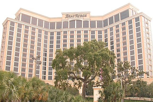
| I am curious as to where this is. We have a Beau Rivage in Gulfport - don't think this is the same one though. Nice shot. |
|
|
|
10/15/2002 07:27:00 PM |
| Nice idea, pic seems too bright though. |
|
|
|
10/15/2002 04:03:00 PM |
| Nice interputation of the challenge! One small nitpick = The right side is 'higher' then the left. I think if you could have 'evened' it out, it may have helped :) |
|
|
|
10/15/2002 03:22:00 PM |
| thats it??? how much effort did u put in this? ow, your DOG thought of it right? |
|
|
|
10/15/2002 09:09:00 AM |
| I see here a place of employment for 3000-4000 regular joes; waiters, room cleaners, servers, cashiers, kitchen staff. Where are the sins? 2 Jak |
|
|
|
10/15/2002 07:34:00 AM |
| Seems to be lacking in colour contrast. |
|
|
|
10/15/2002 12:46:00 AM |
| this is a great idea, it is a little overexposed and I don't like it this bright. 5 -Jubei |
|
|
|
10/14/2002 10:46:00 PM |
|
|
|
10/14/2002 09:33:00 PM |
| Composition: Subject Placement, Cropping, Background 8 , Technical: Focus, Exposure, Lighting, Processing 6 , Appeal: Is it Interesting, Motivating, Etc.? 4 , Total Averaged Rating6 . smshats |
|
|
|
10/14/2002 07:06:00 PM |
| This photo is very bright, but good placement. |
|
|
|
10/14/2002 06:49:00 PM |
| Goo didea. Unfortunatly a rather dull photo. 5/10 |
|
|
|
10/14/2002 03:04:00 PM |
| I like the framing and symmetry of this. The colors are really muted though, making it look flat. Did you try saturation, or boosting contrast any? karmat |
|
|
|
10/14/2002 02:47:00 PM |
| Good idea, but it appears a bit overexposed. |
|
Home -
Challenges -
Community -
League -
Photos -
Cameras -
Lenses -
Learn -
Help -
Terms of Use -
Privacy -
Top ^
DPChallenge, and website content and design, Copyright © 2001-2025 Challenging Technologies, LLC.
All digital photo copyrights belong to the photographers and may not be used without permission.
Current Server Time: 03/12/2025 01:12:35 PM EDT.