| Author | Thread |
|
|
08/25/2008 04:25:26 AM |
| For what it's worth, I thought this was an excellent take on the challenge. Definitely in keeping with the subject but then taking it further, giving it context and weight. And I like the processing - works for me! Great job with this. |
|
 Photographer found comment helpful. Photographer found comment helpful. |
Comments Made During the Challenge  |
|
|
08/24/2008 08:10:46 PM |
| Great lighting and composition. A seven for you. |
|
| Photographer found comment helpful. |
|
|
08/24/2008 12:04:36 AM |
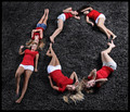
| I hear ya. Good framing of the subject and I like the crop. The numbers in the air aren't necessary, IMO, and they tend to distract. |
|
| Photographer found comment helpful. |
|
|
08/22/2008 10:54:27 PM |
| I like this idea - the colors seem too flat to me, and I don't care for the vignette in the upper left. |
|
| Photographer found comment helpful. |
|
|
08/19/2008 04:39:22 PM |
Very good shot.
I like the composition and the colours. |
|
| Photographer found comment helpful. |
|
|
08/18/2008 01:37:36 PM |
| Interesting idea executed well. I like the muted brownish hue of the photo. |
|
| Photographer found comment helpful. |
|
|
08/18/2008 11:37:51 AM |
| Great idea... the banding at the top left, and the "glow" around the numbers, is a bit too distracting for me. (8) |
|
| Photographer found comment helpful. |
|
|
08/18/2008 01:23:26 AM |
|
| Photographer found comment helpful. |
Home -
Challenges -
Community -
League -
Photos -
Cameras -
Lenses -
Learn -
Help -
Terms of Use -
Privacy -
Top ^
DPChallenge, and website content and design, Copyright © 2001-2025 Challenging Technologies, LLC.
All digital photo copyrights belong to the photographers and may not be used without permission.
Current Server Time: 03/14/2025 01:36:17 AM EDT.