| Author | Thread |
|
|
10/08/2008 01:10:13 AM |
| Very cool abstract. Love the angle you took this act and the variety of textures/surfaces. |
|
 Photographer found comment helpful. Photographer found comment helpful. |
|
|
09/09/2008 10:55:24 PM |
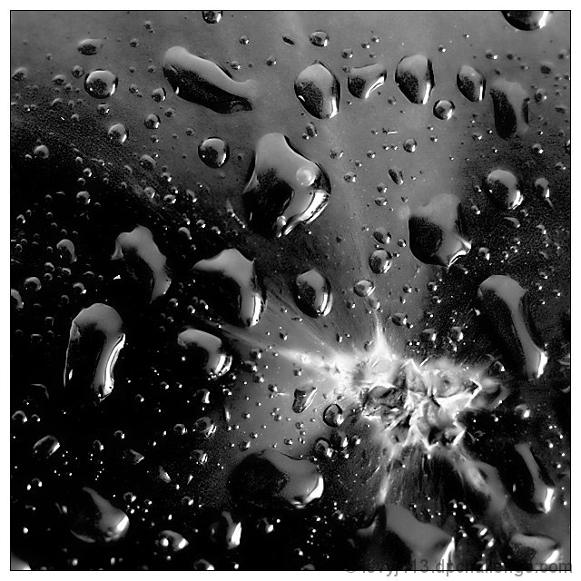
Critique Club Review:
Color Saturation and Hue: N/A image is monochrome
Brightness and Contrast: The darkest areas are nice and inky black. Very nicely done. The brightest areas lose detail, and that would bring it down a bit for me.
Focus and depth of field: Focus is excellent. Depth of field is very good. I have some qualms around the "scar" area. I can't quite tell if the apparent softness is due to processing, depth of field, or just an optical illusion. I'll go with the latter, since I seem to be the only one who sees it.
I'm a little put off by the white area. Compared to the rest of the image it looks almost like a fungus. There are angular bits, but then the whole thing seems a bit soft. The angles are, to me, a bit of a jarring contrast to the drops; to the point where they compete with each other.
I really like the texture of the drops and the surface of the tomato. If the white part were more muted, or not even there, I might even like it a bit better.
As is, a nice creative take on the challenge, and I think it should have finished a bit higher in the voting. |
|
| Photographer found comment helpful. |
|
|
09/08/2008 12:45:25 AM |
| Gotta say this is underrated. Really nice clarity, tones, and composition. Pretty darn cool photo! |
|
| Photographer found comment helpful. |
|
|
09/03/2008 11:24:30 AM |
| Wow...this is a very cool effect! Well done, Jeffrey! |
|
| Photographer found comment helpful. |
|
|
09/03/2008 08:03:35 AM |
| I neglected to comment on this but I did give it a 7. Well done. |
|
| Photographer found comment helpful. |
|
|
09/03/2008 01:34:30 AM |
 PostLuminous Award Nominee! PostLuminous Award Nominee!
superb abstraction, technical excellence |
|
| Photographer found comment helpful. |
Comments Made During the Challenge  |
|
|
09/02/2008 12:06:42 PM |
| My hatred for water-drops takes a back seat to the gorgeous use of the splatter. However, without the water-drops, I'd have been inclined to bump you up 2 or more points. |
|
| Photographer found comment helpful. |
|
|
09/02/2008 10:57:37 AM |
| kind of looks like a galaxy! I'm guessing by the title that's what you were going for. very cool and nice composition. |
|
| Photographer found comment helpful. |
|
|
09/01/2008 09:33:51 PM |
| Strong entry - excellent use of high contrast - the discordant shapes, the spray of light in the lower right, the deep rich blacks - it all creates a wonderful abstract - 7 |
|
| Photographer found comment helpful. |
|
|
08/29/2008 10:35:16 AM |
| Really nicely done! You've done well in creating an abstract WITH something to draw the eye to. The very sharp focus you managed really helps create a clean look to your image. |
|
| Photographer found comment helpful. |
|
|
08/27/2008 05:43:59 PM |
| The title brings this shot to life. |
|
| Photographer found comment helpful. |
|
|
08/27/2008 10:54:13 AM |
| cool.. like an explosion in space.. really like this |
|
| Photographer found comment helpful. |
Home -
Challenges -
Community -
League -
Photos -
Cameras -
Lenses -
Learn -
Help -
Terms of Use -
Privacy -
Top ^
DPChallenge, and website content and design, Copyright © 2001-2025 Challenging Technologies, LLC.
All digital photo copyrights belong to the photographers and may not be used without permission.
Current Server Time: 04/26/2025 08:47:48 PM EDT.