| Author | Thread |
Comments Made During the Challenge  |
|
|
09/01/2008 08:57:27 AM |
| Interesting shot...you obviously thought that B&W meant the subject, not the medium. I would have either shown the complete reflection or just the top portion. Clearly, this is a "DP" shot...it should do well. |
|
 Photographer found comment helpful. Photographer found comment helpful. |
|
|
08/31/2008 05:34:36 PM |
|
|
|
08/31/2008 02:10:17 AM |
|
| Photographer found comment helpful. |
|
|
08/30/2008 11:09:52 AM |
| This is a fun piece. While I would like it even more if the color was either brighter or changed to grayscale, this is original and interesting. Good luck. |
|
| Photographer found comment helpful. |
|
|
08/29/2008 07:29:46 PM |
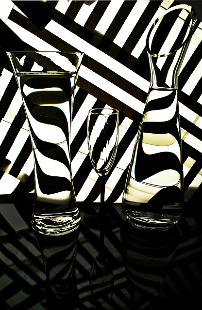
| Hmm... the shapes created are interesting but the composition isn't there for me. I think I would have chopped out most of the photo. Def would say get rid of the whole bottom section, it does nothing for the shot. I might even say to make a bold enough choice as to cut off the tops and bottoms of the glasses completely and have a thin strip of the photo showing the 3 variations of the background lines on in the thickest parts of the glasses. |
|
| Photographer found comment helpful. |
|
|
08/29/2008 04:06:13 PM |
|
| Photographer found comment helpful. |
|
|
08/29/2008 11:22:02 AM |
| This is so cool, but the reflection on the bottom detracts a little bit for me. From the base of the glasses up is excellent! 8 |
|
| Photographer found comment helpful. |
|
|
08/28/2008 05:44:22 PM |
| I really like the reflections and the paterns in this image. Well done!!! 10/10 |
|
| Photographer found comment helpful. |
|
|
08/28/2008 05:43:00 PM |
| Nice setup. This has some traces of yellow from somewhere. |
|
| Photographer found comment helpful. |
|
|
08/27/2008 09:06:23 PM |
| I gave you a really low score for this photo, sorry. This is because the image was shot in colour rather than black and white, so does not meet the challenge for me. I think that the composition is good though. |
|
| Photographer found comment helpful. |
|
|
08/27/2008 07:59:22 PM |
| For me it DNMC as there is yellow / sepia tones in the image, had they not been in there this would have been an 8 from me |
|
| Photographer found comment helpful. |
|
|
08/27/2008 07:10:01 PM |
| I loved the concept, and shot in general. A clser crop would have gotten It a 10 if none of the (table?)surface were in the shot. |
|
| Photographer found comment helpful. |
|
|
08/27/2008 04:41:51 PM |
|
| Photographer found comment helpful. |
|
|
08/27/2008 11:08:17 AM |
| Very nice but is it a true black and white? I think I can see some colour. Ill vote as if it is B&W. |
|
| Photographer found comment helpful. |
|
|
08/27/2008 01:46:20 AM |
| Very nice interpretation from one of the other Abstract challenges... Tan.yellowish color on right throws it off a bit but nicely lit. |
|
| Photographer found comment helpful. |
|
|
08/27/2008 01:25:57 AM |
|
| Photographer found comment helpful. |
|
|
08/27/2008 01:15:23 AM |
| Great idea! I once tried this against the backdrop of the outdoor scenery from inside a moving train. Great job! |
|
| Photographer found comment helpful. |
|
|
08/27/2008 12:44:09 AM |
| very interesting patterns created here! however, the yellow tones will probably get you some lower votes since it is "B&W." Good luck! |
|
| Photographer found comment helpful. |
Home -
Challenges -
Community -
League -
Photos -
Cameras -
Lenses -
Learn -
Help -
Terms of Use -
Privacy -
Top ^
DPChallenge, and website content and design, Copyright © 2001-2025 Challenging Technologies, LLC.
All digital photo copyrights belong to the photographers and may not be used without permission.
Current Server Time: 03/14/2025 03:53:23 PM EDT.