| Author | Thread |
|
|
09/08/2011 12:35:17 AM |
|
Comments Made During the Challenge  |
|
|
09/09/2008 07:43:39 AM |
|
|
|
09/07/2008 10:41:31 PM |
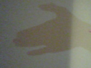
| Oh, you are probably getting slammed in the voting. But it gets a laugh from me. Grainy, a distracting highlight along the right side, and say isn't that the tip of your finger on the right? Still cute! If I were voting I would have given you a 6 for humor and bravery. |
|
 Photographer found comment helpful. Photographer found comment helpful. |
|
|
09/06/2008 07:09:20 PM |
| Very noisy. You should also take advantage of the larger photo capability. |
|
|
|
09/06/2008 10:04:55 AM |
| I have to give this a 3 for various reasons. I *am* trying to be constructive.......the split shadow/light isn't good, there's not anough contrast, the size is too small, and the focus is too soft. You *could* make this work.....it comes across to this viewer as an entry that not very much effort was put into it. I hate leaving visceral, harsh comments, but I am hoping that this will be of some use simply as an honest impression. |
|
| Photographer found comment helpful. |
|
|
09/04/2008 06:44:52 PM |
| Too small, very grainy and poor lighting. |
|
| Photographer found comment helpful. |
|
|
09/04/2008 01:38:19 PM |
|
| Photographer found comment helpful. |
|
|
09/04/2008 03:10:10 AM |
| A great unique idea, photo could be better quality though imho |
|
| Photographer found comment helpful. |
|
|
09/03/2008 08:31:31 PM |
| this is grainy- too small for me to really 'score' properly and tho the concept of a shadow-puppet is nice; it would have been more beneficial on a solid color bgrnd perhaps? (ie: white wall) the line down the 3rd of it is distracting to me; i hope my feedback is useful |
|
| Photographer found comment helpful. |
|
|
09/03/2008 03:08:05 PM |
| I really like the idea of using a shadow puppet, but it is very grainy and the lighter right side is problematic for me. Good idea, though! |
|
| Photographer found comment helpful. |
|
|
09/03/2008 01:53:08 PM |
| Not very big and the light leaves alot to be desired, but the simplicity and originality makes up for it. |
|
| Photographer found comment helpful. |
|
|
09/03/2008 07:01:28 AM |
| nice idea,, shame the photo looks like it was snapped on a camera phone |
|
| Photographer found comment helpful. |
|
|
09/03/2008 01:43:52 AM |
| It would be better with a bit more contrast and without the band of light on the right. |
|
| Photographer found comment helpful. |
Home -
Challenges -
Community -
League -
Photos -
Cameras -
Lenses -
Learn -
Help -
Terms of Use -
Privacy -
Top ^
DPChallenge, and website content and design, Copyright © 2001-2025 Challenging Technologies, LLC.
All digital photo copyrights belong to the photographers and may not be used without permission.
Current Server Time: 04/26/2025 04:07:06 PM EDT.