| Author | Thread |
|
|
09/15/2008 06:00:37 PM |
Critique Club Review
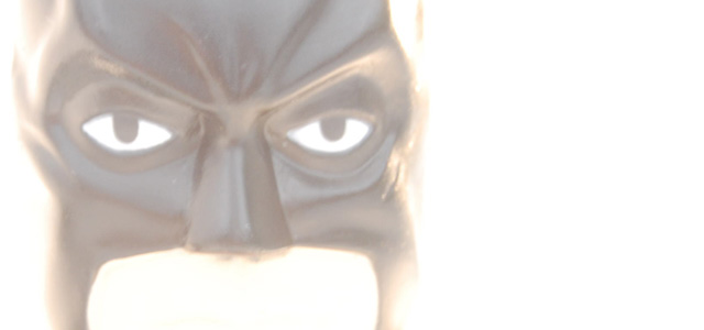
This image meets the challenge, as it is defiently over exposed. However, the large bright area on the right side of the image is very distracting, and seems not to serve a purpose. I see you raised the ISO, and used a longer shutter opening to get the over exposure. I think the higher ISO gave you the noise and grain that appear here. More light, with a lower ISO and shorter exposure could help here.
Had the mask been a little darker, it would have stood out more. If you look at some of the higly ranked entries you can see what I mean.
I do like the mask, and the expression on the mask. I think you have something to work with here. |
|
Comments Made During the Challenge  |
|
|
09/07/2008 04:14:48 PM |
I wish to comment, but this evokes a sort of yes and no response in me. There's a good graphic idea, but maybe it needs sharper lines, or more attention to the quality of light coming through the mask...
All that and overexpose too? Nice try :) |
|
 Photographer found comment helpful. Photographer found comment helpful. |
|
|
09/06/2008 03:04:25 AM |
| Meets the challenge, and there's a certain element of humor here which I like, but I'm not resonating with the subject and the pp. Sorry. |
|
| Photographer found comment helpful. |
|
|
09/03/2008 12:52:04 PM |
| Technically this meets the challenge, but from an artistic point of view this is pretty lacking. |
|
| Photographer found comment helpful. |
Home -
Challenges -
Community -
League -
Photos -
Cameras -
Lenses -
Learn -
Help -
Terms of Use -
Privacy -
Top ^
DPChallenge, and website content and design, Copyright © 2001-2025 Challenging Technologies, LLC.
All digital photo copyrights belong to the photographers and may not be used without permission.
Current Server Time: 03/12/2025 02:16:36 AM EDT.