| Author | Thread |
|
|
09/19/2008 01:26:05 PM |
 PostLuminous Nomination PostLuminous Nomination
well done! [we scoff at the rule of thirds, we do!] |
|
|
|
09/18/2008 03:29:24 PM |
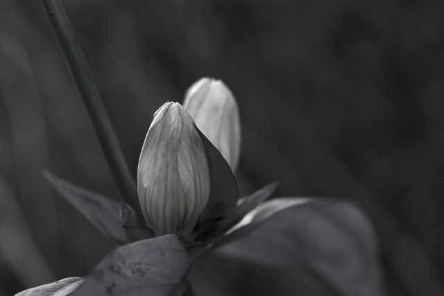
| I do not prefer the color. I very much prefer the black and white. The range of tones almost appear to have color, though I suspect it is indeed truly grayscale. To me it has texture, a soft glow. The color version doesn't do that for me. And I truly do not understand the score. |
|
Comments Made During the Challenge  |
|
|
09/15/2008 06:37:49 PM |
|
|
|
09/15/2008 05:23:58 PM |
| I think this would be more effective if we could see the shape of the subject better. I think I would like it in color as well. Flowers imho do better in color since they're admired for that, but if you're going to take away the color make sure to have some interesting lines or subject placement. A little dry. |
|
|
|
09/12/2008 09:53:09 PM |
| delicate textures here - i would love to see how this one looked in color - but I can imagine the b/w really highlights the light on the blooms |
|
|
|
09/10/2008 10:36:54 PM |
| I understand what you might have been trying to do with this picture, but I think that it would have been better in color than black and white. It is too hard to take pictures of flowers in Black and white because too often are the colors in the flower peadles too soft and hard to make out what the flower actually is. Good idea but I would stick to color with flower close ups, or any plant for that matter that is not the size of a small tree up. |
|
|
|
09/10/2008 01:39:03 AM |
| composition seems awkward, does not follow the 'rule of thirds' nor does it break it in an interesting way |
|
Home -
Challenges -
Community -
League -
Photos -
Cameras -
Lenses -
Learn -
Help -
Terms of Use -
Privacy -
Top ^
DPChallenge, and website content and design, Copyright © 2001-2025 Challenging Technologies, LLC.
All digital photo copyrights belong to the photographers and may not be used without permission.
Current Server Time: 03/12/2025 09:59:19 PM EDT.