| Author | Thread |
Comments Made During the Challenge  |
|
|
10/27/2002 09:27:00 AM |
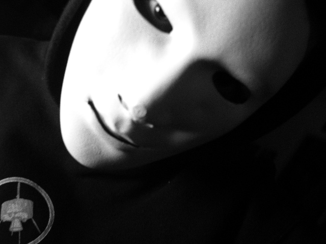
| I think this would be stronger without that symbol in the lower left corner- just my opinion. |
|
|
|
10/26/2002 11:01:00 PM |
|
|
|
10/26/2002 09:49:00 PM |
|
|
|
10/26/2002 04:35:00 PM |
| Nice, would like to print it and hang it on the wall! :) |
|
|
|
10/26/2002 09:59:00 AM |
| If you don't mind I'm going to move up your score and leave a comment. This is a lot deeper photo than I originally gave it credit for. I can't honestly remember voting on it. But the shadows are dramatic, the soft focus works well with this picture and the choice of B&W was very sound, almost essential with this type of shot. I have the Phantom of the Opera in mind looking at it. I wish the crop wasn't so tight though se we could see a little more mask/head. I think it might shift focus to the person wearing the mask as opposed to the mask itself. Very nice shot though. So you go up 2 notches to 7. - Inspzil |
|
|
|
10/24/2002 08:17:00 AM |
| I'd lose the logo in the bottom left (posibbly by cropping closer on the left and bottom), and Id get the eye in sharper focus. Its really good that one eye socket appears empty. |
|
|
|
10/23/2002 08:48:00 AM |
| excellent shot... the soft focus on this one adds a nice 'surreal' aspect to this photo.... good work :) - setzler |
|
|
|
10/22/2002 03:21:00 PM |
| IMHO without focus you put yourself out of contention. Work on that. |
|
|
|
10/22/2002 02:46:00 PM |
| The symbol at the bottom distracts from the eye looking out from the mask which is, in my opinion, the best part of this picture. |
|
|
|
10/22/2002 01:25:00 PM |
| love the lightingand composition, damn focus... : ) |
|
|
|
10/22/2002 10:19:00 AM |
| nice shadow play and I like the soft focus...feel it adds to the "mystery". good shot! |
|
|
|
10/21/2002 10:31:00 PM |
|
|
|
10/21/2002 07:48:00 PM |
| great framing and lighting. Wish the eye was in focus and not sure if the circular object adds to the photo. |
|
|
|
10/21/2002 06:56:00 PM |
| A little creepy, but most definitely dramatic. Good in B&W. I love how the eye is set back a little from the opening in the mask. Like the angle, too. |
|
|
|
10/21/2002 06:37:00 PM |
|
|
|
10/21/2002 01:35:00 PM |
| Pretty freaky, but I wish that the face/eye were more in focus. |
|
|
|
10/21/2002 11:51:00 AM |
Ok your freakin my out.
Vote 8
Sonifo |
|
|
|
10/21/2002 02:06:00 AM |
| I really like this photo. I wish the nose wasn't smushed. Still, great job. |
|
|
|
10/21/2002 01:26:00 AM |
I love this image. Powerful. That face haunts me. Love the composition on the diagonal. Don't know what the symbol in the lower left corner represents; it doesn't matter that i don't understand but i would have preferred to see the image without it. It would have been simpler and starker.Funny, this afternoon I did some dark self portraits as well but feared that my one-eyed face wouldn't go over too well at dpc :) 8 for now; will definitely re-visit later. Journey Again, i love this.
Update: still my favorite; here's your 10 J. |
|
|
|
10/21/2002 01:21:00 AM |
| Wow, great B&W tones. I really like the nice diffused look. The type of picture that belows on a CD cover! |
|
Home -
Challenges -
Community -
League -
Photos -
Cameras -
Lenses -
Learn -
Help -
Terms of Use -
Privacy -
Top ^
DPChallenge, and website content and design, Copyright © 2001-2025 Challenging Technologies, LLC.
All digital photo copyrights belong to the photographers and may not be used without permission.
Current Server Time: 04/26/2025 01:40:03 PM EDT.