| Author | Thread |
Comments Made During the Challenge  |
|
|
05/02/2004 09:51:10 PM |
| more pixels please - the larger pictures always score better. |
|
|
|
05/02/2004 09:06:55 PM |
| THis looks so fantastic in the thumb nail and I can tell it's a great shot/capture. It's too bad the larger image is so small in pixel size. I'm giving it a 7. However, you'll probably find your scores will dramatically increase in future challenges if you use the maximum pixel size possible. |
|
|
|
05/02/2004 08:14:29 PM |
| Too small. Looks good, but I can't judge the picture quality at this size. |
|
|
|
05/02/2004 05:46:55 AM |
|
|
|
05/01/2004 08:54:35 PM |
| Beautiful picture there Looks like you have used the rule of third on both sides!, just wish it were bigger so I could see it better, Good luck |
|
|
|
05/01/2004 06:28:28 PM |
|
|
|
05/01/2004 04:24:38 PM |
| far too small to judge fairly. |
|
|
|
04/29/2004 06:47:19 PM |
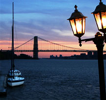
| Nice shot. Believe it might be better if the lamppost had been left out. It takes away from the photo. |
|
|
|
04/29/2004 04:15:54 PM |
| this is so little almost like a thumbnail... :( |
|
|
|
04/29/2004 02:24:09 AM |
| The lamppost does not fit in the composition - sorry. Is there a reason you did not make the image larger? |
|
|
|
04/28/2004 08:46:11 PM |
| I wish this were bigger, it looks like a great shot but it is so hard to tell. |
|
|
|
04/28/2004 06:32:16 PM |
|
|
|
04/28/2004 10:14:04 AM |
| Too small to really appreciate. |
|
|
|
04/27/2004 07:05:50 PM |
| Very nice, love the sunset, love the inclusion of the lights and the boat ... but it's too small to apprreciate details. |
|
|
|
04/27/2004 11:34:19 AM |
OK except for the leaning lampost in the foreground. Disconcerting in view of the
perpendicular mast, and the bridge pillars. Perhaps the lampost was hit by a car? |
|
|
|
04/27/2004 06:17:00 AM |
You have probably got this comment before, but the pic is WAYYY too small to evaluate properly, sorry.
Looks nice though.. |
|
|
|
04/27/2004 12:09:27 AM |
| nice composition-image is a little small and lampost would give a better graphical sensation if it were straightned-but your bridge is perfectly straight-not sure how you could do anything with the lampost-but it does add a nice visual anchor. |
|
|
|
04/26/2004 09:28:39 PM |
| Very nice image - great colors. I'd like to see the full right light in the image - and a bit larger size. |
|
|
|
04/26/2004 01:55:53 PM |
| you need to learn how to keep a normal size image and still get it below 150 k, instructions are on this site. This is too small to judge. |
|
|
|
04/26/2004 01:21:08 PM |
|
|
|
04/26/2004 11:58:49 AM |
|
|
|
04/26/2004 11:39:17 AM |
| just too small for me to really get the details... too bad because you set up the composition well -- just wish it was larger |
|
|
|
04/26/2004 10:25:17 AM |
| The too small size is wasting an amazing photo. the composition and the lighting are really interesting but it's just too small. |
|
|
|
04/26/2004 12:40:03 AM |
| like it, wish it were bigger |
|
Home -
Challenges -
Community -
League -
Photos -
Cameras -
Lenses -
Learn -
Help -
Terms of Use -
Privacy -
Top ^
DPChallenge, and website content and design, Copyright © 2001-2025 Challenging Technologies, LLC.
All digital photo copyrights belong to the photographers and may not be used without permission.
Current Server Time: 03/12/2025 08:10:42 AM EDT.