| Author | Thread |
|
|
05/06/2004 11:44:18 PM |
Greetings from the Critique Club!
The message
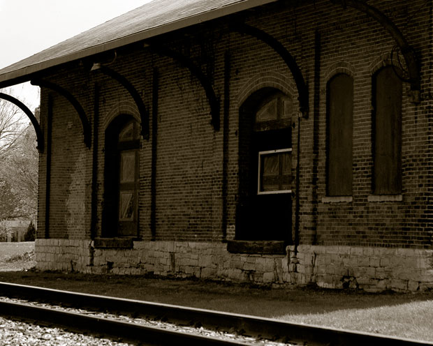
I think this photo captures some of the character of this old station. The sepia color works well, adding to the "old" feeling. But it lacks an element to grab the viewer's attention, making it a bit boring.
Creative choices
The face of the station is in shadow, making it appear rather flat. Early morning or late afternoon light (whichever would illuminate this particular side of the building) would bring out the textures of the bricks and cause the metal roof support to cast interesting shadows. I long to see the left edge of the roof; including it would give better balance and hopefully keep the left corner from looking slanted (it isn't; it just appears that way because of the curve above it). But I like the perspective and the window with the light frame makes a great center of interest.
Technical aspects
The focus is great, although soft (I think a bit more USM would have helped, although that's really a matter of taste). Being mostly in shadow with a bright sky in the background, the photo is somewhat underexposed, causing detail to be lost in the dark shadows. |
|
 Photographer found comment helpful. Photographer found comment helpful. |
Comments Made During the Challenge  |
|
|
05/02/2004 02:07:07 PM |
| Looks a lot like the one where I live. I wish someone would restore it. |
|
|
|
04/27/2004 04:41:15 PM |
| IMO cropped a bit too tight. |
|
| Photographer found comment helpful. |
|
|
04/27/2004 03:53:08 PM |
| I would have preferred a little more light on the building - but you did well with what you had |
|
| Photographer found comment helpful. |
|
|
04/27/2004 10:35:56 AM |
| I think it would be nice to have the building less cropped. I like the absence of color though - conveys a great mood. |
|
| Photographer found comment helpful. |
|
|
04/27/2004 09:50:12 AM |
The shadow is a bit too dark. More space on the left of the building would have helped.
|
|
| Photographer found comment helpful. |
|
|
04/26/2004 03:55:18 PM |
| I think I would have liked this better if it were taken at a time of day when the sun struck this side of the building |
|
| Photographer found comment helpful. |
Home -
Challenges -
Community -
League -
Photos -
Cameras -
Lenses -
Learn -
Help -
Terms of Use -
Privacy -
Top ^
DPChallenge, and website content and design, Copyright © 2001-2025 Challenging Technologies, LLC.
All digital photo copyrights belong to the photographers and may not be used without permission.
Current Server Time: 03/13/2025 01:50:57 AM EDT.