| Author | Thread |
Comments Made During the Challenge  |
|
|
05/04/2004 11:21:26 PM |
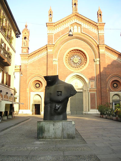
| a picture of artwork...please read the rules |
|
|
|
05/03/2004 09:06:44 PM |
| Nice picture. Bright areas seem a little washed out. |
|
|
|
05/01/2004 06:59:19 AM |
| Interesting idea - could've been cropped a bit more though, I think, and had the exposure adjusted - the sky is blown out. Photoshop is great for things like that if you've got it |
|
|
|
04/28/2004 08:10:54 PM |
| The subject was proportion. |
|
|
|
04/28/2004 05:51:11 PM |
|
|
|
04/28/2004 11:54:55 AM |
| hehe, abstract is the new challenge, not this one =) |
|
|
|
04/28/2004 11:34:24 AM |
| Not much more than a snapshot of a statue, the framing is uninspiring. |
|
|
|
04/28/2004 11:06:53 AM |
Composition: Subject Placement, Cropping, Background 5
Technical: Focus, Exposure, Lighting, Processing 6
Appeal: Is it Interesting, Motivating, Etc.? 3
How well does it meet the challenge: 4
Total Averaged Rating 5 Autool
|
|
 Photographer found comment helpful. Photographer found comment helpful. |
Home -
Challenges -
Community -
League -
Photos -
Cameras -
Lenses -
Learn -
Help -
Terms of Use -
Privacy -
Top ^
DPChallenge, and website content and design, Copyright © 2001-2025 Challenging Technologies, LLC.
All digital photo copyrights belong to the photographers and may not be used without permission.
Current Server Time: 03/12/2025 07:32:11 AM EDT.