| Author | Thread |
Comments Made During the Challenge  |
|
|
05/04/2004 03:25:27 AM |
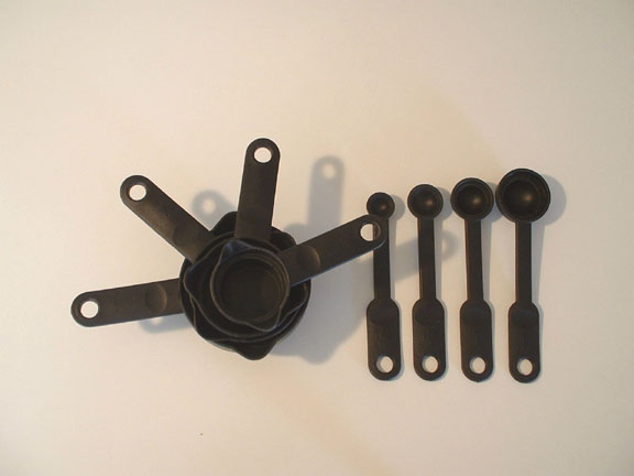
| Cool !!! .. Maybe a huge Stawberry in one of the utensils would have brought out the proportion better .... |
|
|
|
05/02/2004 08:03:27 PM |
|
|
|
05/01/2004 10:39:02 PM |
| looks washed out. needs more contrast / better lighting |
|
|
|
04/30/2004 11:57:41 AM |
| Placement well done - shadows very effective. Background should be cleaner. |
|
|
|
04/28/2004 08:47:15 PM |
| White balance should be corrected here |
|
|
|
04/28/2004 06:09:30 PM |
|
|
|
04/28/2004 04:06:48 PM |
| This is an interesting idea but I'm not floored by this arrangement. I think it might have been more effective if you had just used the spoons and made a more interesting use of negative space. As it is, the negative space in this composition is static and boring. |
|
|
|
04/28/2004 01:31:54 PM |
| i think the way they are laid out could be more interesting. also could be sharper |
|
|
|
04/28/2004 04:19:12 AM |
| good concept. the shadow a little too harsh |
|
|
|
04/28/2004 02:34:40 AM |
| light and shadow not quite perfect ! |
|
|
|
04/28/2004 12:43:08 AM |
| Maybe a 2nd light source on the right would have eliminated the shadows which are kinda distracting. |
|
Home -
Challenges -
Community -
League -
Photos -
Cameras -
Lenses -
Learn -
Help -
Terms of Use -
Privacy -
Top ^
DPChallenge, and website content and design, Copyright © 2001-2025 Challenging Technologies, LLC.
All digital photo copyrights belong to the photographers and may not be used without permission.
Current Server Time: 03/12/2025 09:41:09 AM EDT.