| Author | Thread |
Comments Made During the Challenge  |
|
|
05/04/2004 03:08:28 AM |
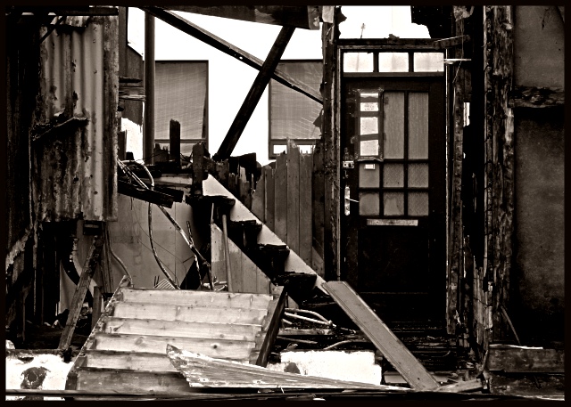
| Great picture. What I got from the picture is something so small in perportion thaty could have caused blown this way out of porportion. |
|
|
|
04/30/2004 01:35:38 PM |
| Just like home... :) Nice Sephia but I wonder how it was in collor? |
|
|
|
04/30/2004 06:43:02 AM |
| I think the subject of this shot could have produced a far more dramatic result. The area to the right of the door could hav been cropped out. |
|
 Photographer found comment helpful. Photographer found comment helpful. |
|
|
04/29/2004 04:31:25 PM |
| i like this photo it is very interesting and well shot but am having a hard time noticing the challenge criteria. |
|
|
|
04/29/2004 11:28:43 AM |
| Beautiful ... great contrast , I love the way the windows of the building behind the burnt foreground building appear to be part of the fore ground building - thus distorting the proportion of space. Nice job. |
|
| Photographer found comment helpful. |
|
|
04/28/2004 06:56:29 PM |
too busy. it's a nice shot but i don't get the proportion bit.
|
|
|
|
04/28/2004 11:59:45 AM |
| a bit jumbled so I'm not connecting to what you as the photographer saw in the shot. |
|
|
|
04/28/2004 10:50:47 AM |
| I really enjoyed the chaotic nature of this photo. I think it fits well into this challenge as there are so many proportions to see at the same time. I really like it! |
|
| Photographer found comment helpful. |
Home -
Challenges -
Community -
League -
Photos -
Cameras -
Lenses -
Learn -
Help -
Terms of Use -
Privacy -
Top ^
DPChallenge, and website content and design, Copyright © 2001-2025 Challenging Technologies, LLC.
All digital photo copyrights belong to the photographers and may not be used without permission.
Current Server Time: 03/12/2025 08:10:10 PM EDT.