| Author | Thread |
Comments Made During the Challenge  |
|
|
05/04/2004 08:52:06 PM |
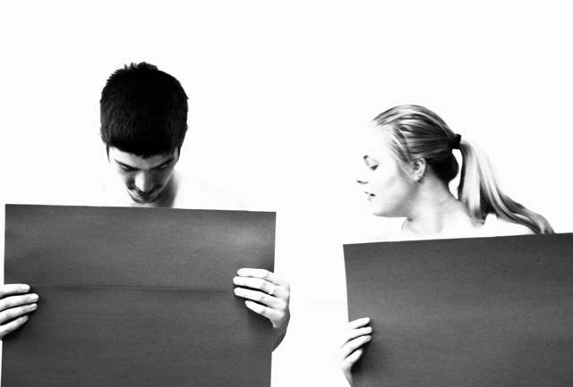
| interesting idea. Not sure what to think of the details on the girls face being blown out. |
|
|
|
05/04/2004 01:15:41 PM |
| the idea is pretty funny, but the picture does seem a bit overexposed (maybe you wanted it like this) ... i would have liked a bit more greyscale on the people (the girls face almost disappears in the background, so do the guys shoulders) ... and the cardboard blacker ... 7 |
|
|
|
05/04/2004 10:29:42 AM |
| think that name is long enough? |
|
|
|
05/04/2004 02:00:24 AM |
| i have no idea what this is meaning.... |
|
|
|
05/01/2004 03:47:05 PM |
| This almost works. I think in understand what the comparison is. If they are comparing body parts, then show enough shoulder to show they have nothing on, and decrease the exposure on the whole picture so they show up better against the background. If i'm wrong, just disregard. I think it's a neat idea anyway. 7 |
|
|
|
04/30/2004 12:10:33 PM |
| Hmmm. great idea. One of the most original in the challenge - an extra point for the creative approach. It works well in black and white...but the girl's face and the man's shoulders blend into the white background. |
|
|
|
04/30/2004 12:08:38 PM |
|
|
|
04/30/2004 02:06:55 AM |
| wow this is great!! i hope this wins!! |
|
|
|
04/29/2004 09:39:51 PM |
| hahaha aw thats hillarious i like that pic (= |
|
|
|
04/29/2004 03:45:00 PM |
| This one is very artistic. I like it very much. Good luck! |
|
|
|
04/29/2004 01:05:57 AM |
|
|
|
04/28/2004 11:10:55 PM |
| nice !! my only 10. funny pic. |
|
|
|
04/28/2004 08:00:59 PM |
| over-exposed (in more ways than one) |
|
|
|
04/28/2004 07:44:51 PM |
| Are they checking out the size of his penis? He is looking directly down and she is looking down toward him so that's my guess based on this challenge. But why such high key contrast? The girls face and the guys shirt disappear into the background. Was this the intention? What is it saying about proportion? Why are they holding grey paper in front of themselves? This is really just a confusing jumble and doesn't say much about proportion. The title isn't working too hard for you either. |
|
|
|
04/28/2004 02:48:37 PM |
| Cute picture, but consider a more concise title. |
|
|
|
04/28/2004 01:31:47 PM |
| Funny! The blownout background works well here. Good Job! 8 |
|
|
|
04/28/2004 11:50:56 AM |
| i like this shot...as i was looking i thought...hmmm...ahhhh...chuckle,chuckle. very thought provoking, well done. |
|
|
|
04/28/2004 11:22:41 AM |
| Great idea, props, expressions etc, black and white works really well, but the girl isn't sharp, both have lost their necks with the white background (She has lost all definition on her forehead) which may have been deliberate but I think destraccts from the image. |
|
|
|
04/28/2004 11:13:52 AM |
Composition: Subject Placement, Cropping, Background 5
Technical: Focus, Exposure, Lighting, Processing 3
Appeal: Is it Interesting, Motivating, Etc.? 6
How well does it meet the challenge: 10
Total Averaged Rating 5 Autool
|
|
|
|
04/28/2004 02:47:41 AM |
| Funny idea, - and I also appreciate that it isn't technically "perfect". Very nice! |
|
|
|
04/28/2004 01:57:23 AM |
| Looking for your car keys? |
|
Home -
Challenges -
Community -
League -
Photos -
Cameras -
Lenses -
Learn -
Help -
Terms of Use -
Privacy -
Top ^
DPChallenge, and website content and design, Copyright © 2001-2025 Challenging Technologies, LLC.
All digital photo copyrights belong to the photographers and may not be used without permission.
Current Server Time: 03/12/2025 03:24:52 PM EDT.