| Author | Thread |
|
|
05/06/2004 05:12:54 PM |
| Wow some people really know how to make someone who is new feel like crap and never want to enter a challenge again. I will be sure not to come back soon |
|
Comments Made During the Challenge  |
|
|
05/04/2004 11:10:02 PM |
|
|
|
05/03/2004 09:03:00 AM |
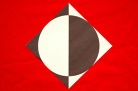
| This would have been almost perfect for the abstract challenge. Not really sure how it fits into this challenge. The size of the shot really hurts, if you could bump the size up, that would really help. Also the red cloth is wrinkled and pulls my eye away from from the main subject. The subject looks more brown and white than black and white (I'm guessing you were going for black and white) and yes, my monitor is calibrated. The overall composition and croppping of the shot is well done. A 3 |
|
|
|
05/02/2004 08:41:58 PM |
|
|
|
05/01/2004 10:25:24 PM |
| confusing indeed. confused about why this was submitted for a challenge called "Proportion" |
|
|
|
05/01/2004 04:21:41 PM |
|
|
|
05/01/2004 03:17:51 AM |
|
|
|
05/01/2004 01:27:38 AM |
|
|
|
04/30/2004 02:49:53 PM |
| Yes, very confusing why you made such a good entry so small. |
|
|
|
04/30/2004 12:12:11 PM |
| The color choices on this are excellent, but I honestly can't tell what message you are trying to send. Is this perfectly proportioned or completely lacking in proportion? I think to make this strong, you might think about an object for reference size wise. |
|
|
|
04/29/2004 09:32:59 PM |
|
|
|
04/28/2004 11:41:10 PM |
| "Confusing"? Yes, it IS confusing! ;-) Not sure how this fits the proportion theme? Picture-wise, it needs more contrast and the red background shows wrinkles. Also, the image is too small. |
|
|
|
04/28/2004 08:15:36 AM |
| Use the whole 640 width that you are allowed. |
|
|
|
04/28/2004 01:16:48 AM |
| This could just as easily be a drawing as a photograph. |
|
Home -
Challenges -
Community -
League -
Photos -
Cameras -
Lenses -
Learn -
Help -
Terms of Use -
Privacy -
Top ^
DPChallenge, and website content and design, Copyright © 2001-2025 Challenging Technologies, LLC.
All digital photo copyrights belong to the photographers and may not be used without permission.
Current Server Time: 03/12/2025 06:36:20 PM EDT.