| Author | Thread |
Comments Made During the Challenge  |
|
|
10/24/2002 09:29:00 PM |
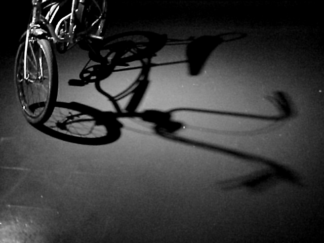
| Blurry, and black and white doesn't quite do it. good luck:) |
|
|
|
10/24/2002 06:20:00 PM |
| What a switch. See all of shadow and only little of subject. Well done. Adds something different to photo. Good lighting and especially good use of shadow |
|
|
|
10/23/2002 10:31:00 AM |
| Cool shot! If you could have cropped out the bright spot in the bottom left corner, it would be even more dramatic. |
|
|
|
10/22/2002 10:48:00 PM |
|
|
|
10/22/2002 11:04:00 AM |
| The concept here is quite good... the image quality, on the other hand, is weak. - setzler |
|
|
|
10/21/2002 10:33:00 PM |
| just not very interesting. |
|
|
|
10/21/2002 07:05:00 PM |
| cool idea. it need a bit more of focus or resolution. : ) |
|
|
|
10/21/2002 04:56:00 PM |
| I'm not sure the framing is effective here. I think the bike might be better if it were a little bit more in the frame, and a little bit more in the light to cast a more complete shadow. A sharper shadow would also have helped. The subject doesn't really impress me either. 3 wingy |
|
|
|
10/21/2002 03:28:00 PM |
| very well composed shot. Nicely framed. Very original. Missing alittle soemthing. And it seems blury (is it the jpg compression?). 6 |
|
|
|
10/21/2002 02:47:00 PM |
| The shadow is awesome, crisp and clear. The bike looks oversharpened to me. Great idea. karmat |
|
|
|
10/21/2002 11:33:00 AM |
It seems blurry, not sure if that was your intention. I like the black and white.
Vote 6
Sonifo |
|
|
|
10/21/2002 09:36:00 AM |
| Shine on the lower left is a bit distracting. This was a good idea, creative shot. Justine. |
|
|
|
10/21/2002 05:11:00 AM |
Was this shot on a steady platform? It looks like camera shake.
Like the idea but in this state it is not pleasant to watch. |
|
|
|
10/21/2002 03:11:00 AM |
| The negative space at the bottom seems uneccesary |
|
Home -
Challenges -
Community -
League -
Photos -
Cameras -
Lenses -
Learn -
Help -
Terms of Use -
Privacy -
Top ^
DPChallenge, and website content and design, Copyright © 2001-2025 Challenging Technologies, LLC.
All digital photo copyrights belong to the photographers and may not be used without permission.
Current Server Time: 03/12/2025 01:55:20 AM EDT.