| Author | Thread |
|
|
09/09/2004 12:24:01 AM |
| I love the tones and composition of this one! |
|
 Photographer found comment helpful. Photographer found comment helpful. |
|
|
09/06/2004 11:05:42 PM |
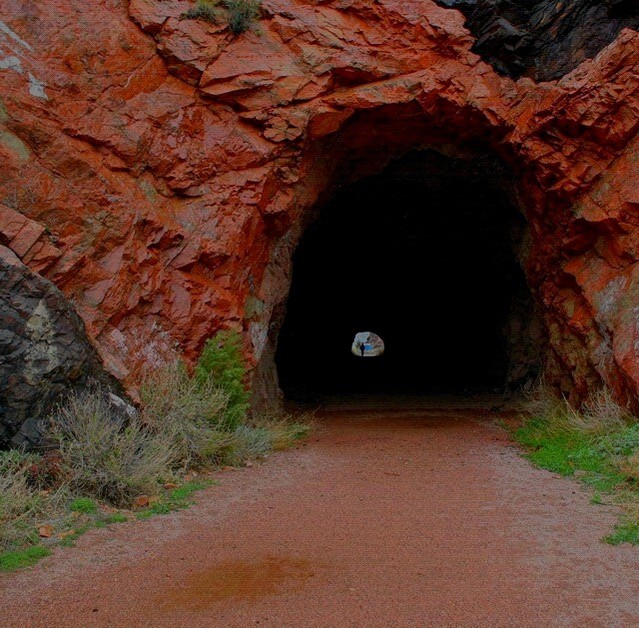
Use of levels and curves would really make this composition would add an extra punch and make it pop even more. The beautiful red rocks are incredible, you can almost feel the sharp edges on them.Helps to frame your subject very well.
Tahe viewers eyes is lead through the cave toward the other end effectively with the use of the contrast of the interior of the cave and the light coming from the other end. |
|
| Photographer found comment helpful. |
|
|
09/06/2004 09:50:13 PM |
|
| Photographer found comment helpful. |
Comments Made During the Challenge  |
|
|
05/04/2004 09:18:51 PM |
| Just a bit more brightened would have added a lot without taking away the mood. |
|
| Photographer found comment helpful. |
|
|
05/04/2004 05:31:44 PM |
| My favourite of the challenge. Great shot 9 |
|
| Photographer found comment helpful. |
|
|
05/04/2004 01:34:57 AM |
| Love the richness of the rock, great contrast |
|
| Photographer found comment helpful. |
|
|
05/02/2004 09:58:09 AM |
|
| Photographer found comment helpful. |
|
|
05/02/2004 03:52:52 AM |
| Colors work well be seem a bit unnatural. The far end of the tunnel is a great idea bur seems to be floating in a dark space. |
|
| Photographer found comment helpful. |
|
|
04/30/2004 01:48:42 PM |
|
| Photographer found comment helpful. |
|
|
04/28/2004 01:26:09 PM |
| I like this a lot...great shot. 7 |
|
| Photographer found comment helpful. |
|
|
04/28/2004 12:39:57 PM |
Composition: Subject Placement, Cropping, Background 9
Technical: Focus, Exposure, Lighting, Processing 7
Appeal: Is it Interesting, Motivating, Etc.? 5
How well does it meet the challenge: 5
Total Averaged Rating 7 Autool
|
|
| Photographer found comment helpful. |
|
|
04/28/2004 02:10:48 AM |
| I like this shot a lot. the person at the end really makes it. very interesting colors. this shot should do well in the challenge. my top pick so far. |
|
| Photographer found comment helpful. |
|
|
04/28/2004 12:44:03 AM |
| Beautifully composed, but looks over-saturated. Nice shot. |
|
| Photographer found comment helpful. |
|
|
04/28/2004 12:37:25 AM |
| A great illustration of the proportion. The image needs some work though. It feels muddy and flat. You might try using levels. I'm confident you can get it to look much better. It's still one of the best in the group for showing proportion. |
|
| Photographer found comment helpful. |
Home -
Challenges -
Community -
League -
Photos -
Cameras -
Lenses -
Learn -
Help -
Terms of Use -
Privacy -
Top ^
DPChallenge, and website content and design, Copyright © 2001-2025 Challenging Technologies, LLC.
All digital photo copyrights belong to the photographers and may not be used without permission.
Current Server Time: 04/26/2025 08:47:50 PM EDT.