| Author | Thread |
Comments Made During the Challenge  |
|
|
10/24/2008 04:08:28 PM |
|
 Photographer found comment helpful. Photographer found comment helpful. |
|
|
10/23/2008 03:13:03 AM |
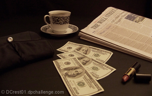
| Nice idea. I think there's just a bit too much empty space- especially on the left vs. everything on the right. It seems unbalanced. Creative though. |
|
| Photographer found comment helpful. |
|
|
10/22/2008 11:13:30 PM |
| Nice layout, though overall the colors seem a bit dull to me. I popped this into PSP to have a look and noticed the histogram was flat on the right 10-15% of the chart. Some easy adjustments would really help this to pop. |
|
| Photographer found comment helpful. |
|
|
10/22/2008 02:36:13 PM |
| Very creative idea! Could use a bit more contrast, imo. |
|
| Photographer found comment helpful. |
|
|
10/22/2008 01:53:05 PM |
| Very sensual photograph. Like the lighting and the idea. |
|
| Photographer found comment helpful. |
Home -
Challenges -
Community -
League -
Photos -
Cameras -
Lenses -
Learn -
Help -
Terms of Use -
Privacy -
Top ^
DPChallenge, and website content and design, Copyright © 2001-2025 Challenging Technologies, LLC.
All digital photo copyrights belong to the photographers and may not be used without permission.
Current Server Time: 03/10/2025 06:09:21 PM EDT.