| Author | Thread |
|
|
10/29/2008 09:12:32 AM |
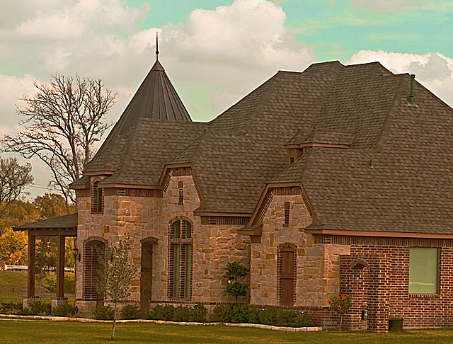
The house is a nice subject for affluence, although better landscaping would help take it out of the "new development" arena. I think there are two things you could have done to quickly improve this image. First straighten it -- rotate it counter clockwise so that the eaves of the roof are horizontal. And second, adjust the levels and color. Bring out the yellows and reds a bit so it will appear brighter and less muddy. The white halo around along the roof indicates this may have been sharpened a bit too much. If you had taken this at a time of day when the sun was lighting the front of the house, I think the image would have had more impact.
And if you feel like doing any further work on this shot, now that the challenge is over, you might consider taking out the guardrail in the background.
Message edited by author 2008-10-29 09:14:13. |
|
 Photographer found comment helpful. Photographer found comment helpful. |
Comments Made During the Challenge  |
|
|
10/28/2008 04:58:20 PM |
to improve this you could straighten the verticals and boost the contrast
Good luck |
|
| Photographer found comment helpful. |
|
|
10/23/2008 09:55:19 PM |
| Not sure what happened to the sky. But the colour seems off on this one. Also I think if you composed the house from the front with the surrounding estate? to give it some scale. |
|
|
|
10/23/2008 10:52:57 AM |
|
|
|
10/22/2008 01:58:13 PM |
| The colors are a tad off, the house looks like it is leaning, pretty house. |
|
| Photographer found comment helpful. |
Home -
Challenges -
Community -
League -
Photos -
Cameras -
Lenses -
Learn -
Help -
Terms of Use -
Privacy -
Top ^
DPChallenge, and website content and design, Copyright © 2001-2025 Challenging Technologies, LLC.
All digital photo copyrights belong to the photographers and may not be used without permission.
Current Server Time: 03/16/2025 07:29:22 PM EDT.