| Author | Thread |
Comments Made During the Challenge  |
|
|
10/26/2002 01:42:00 AM |
| A little on the blurry side for me. |
|
|
|
10/25/2002 11:52:00 AM |
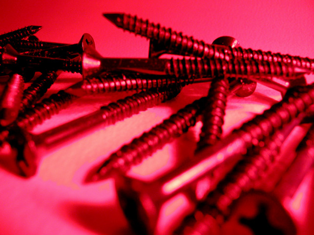
The sqrews in the bottom right hand corner are out of focus. It really bugs my eyes. Maybe if you used your depth of field setting it would cure that.
Vote 5
Sonifo |
|
|
|
10/24/2002 08:23:00 PM |
| Must be me. But I don't go for all these "red" shots. Not eye appealing as far as I'm concerned. Someone must like it. There are a lot of them. But on yours, I like the arrangement of the screw - more on outside and back than in middle. Problem is none of them are clear and sharp. At least one or two need to be. All are out of focus here. I find my eyes going to the empty lighter space in middle fading to bottom left corner. |
|
|
|
10/23/2002 10:23:00 PM |
|
|
|
10/23/2002 10:35:00 AM |
| Like this alot. Would like to know how you did the color. |
|
|
|
10/22/2002 04:42:00 PM |
| It's pretty pink, is the message masonry screws are for girls? Central subject in good focus. Could this be a black light tinted to red? 6 Swash |
|
|
|
10/22/2002 01:36:00 PM |
|
|
|
10/21/2002 09:40:00 PM |
| Would have been better if it was sharper |
|
|
|
10/21/2002 08:59:00 PM |
| the combination of the subject which isn't interesting and the out of focus in the foreground make this a difficult picture to rate highly. |
|
|
|
10/21/2002 01:21:00 PM |
| Where is the true focus? I like all the variety of focus but the one that is REALLY in focus should be so for a reason. Here it is the screws at the very back. Like the lighting though. |
|
|
|
10/21/2002 08:58:00 AM |
| arrrggh.. another screw photo... not as well lit as the other picture, but the challenge is for interpretations of lighting.. so I'll give you a 7 |
|
|
|
10/21/2002 06:21:00 AM |
| Spooky... My piccy is quite similiar (in content rather than lighting) to this one. (Great minds, etc.) Hmm... best give it at least a reasonably vote then... seasick - 7. |
|
|
|
10/21/2002 03:14:00 AM |
| I just can't find anywhere to focus on, except now that I look at it again, in the top left. The red lighting makes it really confusing and "screwed up". LOL |
|
|
|
10/21/2002 12:48:00 AM |
| Very neat, the bottom half is blurred out though! I like the color! |
|
Home -
Challenges -
Community -
League -
Photos -
Cameras -
Lenses -
Learn -
Help -
Terms of Use -
Privacy -
Top ^
DPChallenge, and website content and design, Copyright © 2001-2025 Challenging Technologies, LLC.
All digital photo copyrights belong to the photographers and may not be used without permission.
Current Server Time: 03/12/2025 05:06:39 PM EDT.