| Author | Thread |
|
|
05/16/2004 07:33:02 PM |
Hi from the Critique Club
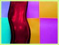
I really love the feel of this abstract. Turning the photo is what made it work so well, I think. The colors are very modern and clean looking, which accents the lines perfectly. I even like the angle and the white space in the upper left. They all work together to make the viewer want to keep looking at the shot.
I think post processing does it's job here as well....maximizing the potential of the shot while maintaining the basics of the photo. It's a great shot for this challenge.
I don't really see anything I would change about the way you've done this one. Congratulations on a great shot!
Judy |
|
 Photographer found comment helpful. Photographer found comment helpful. |
|
|
05/10/2004 03:13:32 AM |
thanks Jose, congrats too on the 6th place finish. |
|
| Photographer found comment helpful. |
|
|
05/10/2004 12:46:45 AM |
| Wooohooo! A personal best! I'd like to thank EVERYONE who took their time to comment on my entry. |
|
Comments Made During the Challenge  |
|
|
05/09/2004 11:32:26 PM |
| Very interesting shot... meets the challenge well. The tilt is a little strange, but it works well as an abstract. |
|
| Photographer found comment helpful. |
|
|
05/09/2004 11:27:19 PM |
|
| Photographer found comment helpful. |
|
|
05/09/2004 10:20:36 PM |
| Pretty cool with the purplish color on the window panes. Looks like you rotated the image 90 degrees to the left. I like it all except the white space upper left. Wish the lines extended into that area as well. |
|
| Photographer found comment helpful. |
|
|
05/09/2004 04:56:44 AM |
| I really like the color and the lines. Nice job, what is it? |
|
| Photographer found comment helpful. |
|
|
05/06/2004 02:57:56 PM |
| Cool! Would love to know where and how you did that. |
|
| Photographer found comment helpful. |
|
|
05/06/2004 11:08:10 AM |
| Lines and colors awesome capture......9 |
|
| Photographer found comment helpful. |
|
|
05/06/2004 02:20:46 AM |
| I spent lots of time looking at this one from different angles trying to figure out which way was up. Good thing I viewed this on my laptop. :) It has an MC Escher feel about it which I like. I would have cropped it a bit tighter off the bottom. I can see some barrel distortion in the lighter squares. I think it would have been minimized if you had cropped all the way to the darker squares above them. 7. |
|
| Photographer found comment helpful. |
|
|
05/05/2004 10:33:53 PM |
| The intensity and crisp angles and color just really held me. Scored it very high!!!!!!! |
|
| Photographer found comment helpful. |
|
|
05/05/2004 11:09:33 AM |
| love the colour and the transparency of the panes within the 3d Mondrian like grid. Good work. |
|
| Photographer found comment helpful. |
|
|
05/04/2004 08:22:06 PM |
Great display of angles, nice color too. The whole thing looks good. 8
Good luck... |
|
| Photographer found comment helpful. |
|
|
05/04/2004 07:52:54 PM |
| Very nice picture. I think it might have been a bit nicer to look at if it hadn't been slightly tipped. |
|
| Photographer found comment helpful. |
|
|
05/04/2004 11:04:30 AM |
Well done. Fits 100% the theme, but preserve "photographic integrity" 100% too.
Like the compo and colorizing. 10 |
|
| Photographer found comment helpful. |
|
|
05/03/2004 06:59:19 PM |
|
| Photographer found comment helpful. |
|
|
05/03/2004 03:02:51 PM |
|
| Photographer found comment helpful. |
|
|
05/03/2004 12:50:34 AM |
| Very interesting shot and very well captured I might add. Very contemporary, great angle. |
|
| Photographer found comment helpful. |
|
|
05/03/2004 12:32:39 AM |
| Really nice. Very Escher. |
|
| Photographer found comment helpful. |
Home -
Challenges -
Community -
League -
Photos -
Cameras -
Lenses -
Learn -
Help -
Terms of Use -
Privacy -
Top ^
DPChallenge, and website content and design, Copyright © 2001-2025 Challenging Technologies, LLC.
All digital photo copyrights belong to the photographers and may not be used without permission.
Current Server Time: 03/14/2025 05:58:13 AM EDT.