| Author | Thread |
Comments Made During the Challenge  |
|
|
05/11/2004 11:31:53 AM |
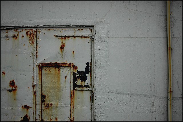
| I don't find this subject too interesting. There is a lot of dirty white space in this photo and the framing seems to pull emphasis away from the doors as the main subject. |
|
|
|
05/11/2004 09:59:31 AM |
| This is another "less is more" shot which I really like. The plain background makes you want to pay more attention to the subtle details in the door. The pipe on the right is a great balancing detail, and I'm glad you left it in the image. Well done! |
|
 Photographer found comment helpful. Photographer found comment helpful. |
|
|
05/09/2004 09:55:11 PM |
Composition: Subject Placement, Cropping, Background 5
Technical: Focus, Exposure, Lighting, Processing 6
Appeal: Is it Interesting, Motivating, Etc. 3
How well does it meet the challenge: 7
Total Averaged Rating(Rounded) 5
|
|
| Photographer found comment helpful. |
|
|
05/09/2004 05:55:56 PM |
| ...and, it's beside a rusty pipe. |
|
| Photographer found comment helpful. |
|
|
05/09/2004 03:05:15 PM |
Picture appears far too dark for my taste. Also composition and subject a little lacking in appeal.
A 4. |
|
| Photographer found comment helpful. |
|
|
05/07/2004 11:38:41 PM |
Composition: Subject Placement, Cropping, etc. 4
Technical: Focus, Exposure, Lighting, Processing 4
Appeal: Is it Interesting, Motivating, Etc.? 3
Does this picture meet the challenge?(5pts) Yes
Total Challenge Weighted Average 4 Bill
More light and a tighter crop on the right side would have changed this score a lot. The idea and subject are pretty good, but the pole and darkness of the shot bury some of a good idea. |
|
| Photographer found comment helpful. |
|
|
05/07/2004 06:35:30 PM |
| Change the title and I'd love it. Great offset from center for main subject. Looks kind of eerie to me. Good job! |
|
| Photographer found comment helpful. |
|
|
05/07/2004 12:26:20 PM |
Composition: Subject Placement, Cropping, Background 4
Technical: Focus, Exposure, Lighting, Processing 6
Appeal: Is it Interesting, Motivating, Etc.? 3
How well does it meet the challenge: 8
Total Averaged Rating 4 Dick
|
|
| Photographer found comment helpful. |
|
|
05/05/2004 03:45:33 PM |
| The door itself is very nice, good find. My suggestions for improvement are: 1) Image is under exposed giving it a flat feel. I think the walls are probably white and not gray as shown. When shooting white subjects be sure to open up a bit. 2) The picture is in the door - so the entire right half of the image is unneeded and should be cropped out. Instead get in tighter on the door, probably in a vertical format show you can get the entire door. |
|
| Photographer found comment helpful. |
|
|
05/05/2004 11:00:04 AM |
| Pretty dark area for your shot. The levels could use some adjustment so that the white is white. Cool find but would of been better to show less of the top and a bit more of the bottom door frame. |
|
| Photographer found comment helpful. |
Home -
Challenges -
Community -
League -
Photos -
Cameras -
Lenses -
Learn -
Help -
Terms of Use -
Privacy -
Top ^
DPChallenge, and website content and design, Copyright © 2001-2025 Challenging Technologies, LLC.
All digital photo copyrights belong to the photographers and may not be used without permission.
Current Server Time: 04/26/2025 05:07:42 AM EDT.