| Author | Thread |
Comments Made During the Challenge  |
|
|
11/17/2008 08:55:47 PM |
| Too dark, not enough contrast between the background and subject, & the scratches in the wood detract from the image. |
|
 Photographer found comment helpful. Photographer found comment helpful. |
|
|
11/16/2008 11:29:05 PM |
| very creative and nicely shot 9 |
|
| Photographer found comment helpful. |
|
|
11/15/2008 06:12:52 PM |
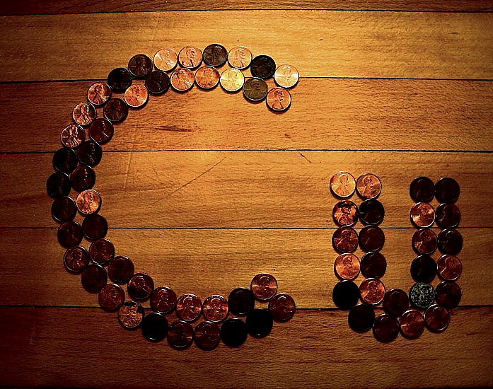
| How'd you keep them from sliding off to the left? A bit of distortion there. Nice concept, but try backing the camera up a bit (to relieve the distortion)and using light other than what appears to be on camera flash. |
|
| Photographer found comment helpful. |
|
|
11/14/2008 08:59:47 PM |
|
| Photographer found comment helpful. |
|
|
11/14/2008 07:11:54 PM |
|
| Photographer found comment helpful. |
|
|
11/13/2008 02:52:48 PM |
| i like your lighting, cool background as well |
|
| Photographer found comment helpful. |
|
|
11/12/2008 02:59:30 PM |
| Great idea, maybe against a different background would make it stand out even more |
|
| Photographer found comment helpful. |
|
|
11/11/2008 05:52:15 PM |
| I see that it is copper but just not a very attractive photography that I wuld have had on my wall |
|
| Photographer found comment helpful. |
|
|
11/11/2008 04:42:43 PM |
| Interesting and cute concept but the lighting is not the greatest to show the entire range of details. |
|
| Photographer found comment helpful. |
|
|
11/11/2008 02:52:00 PM |
| interesting, though lacking contrast a little |
|
| Photographer found comment helpful. |
|
|
11/11/2008 12:27:35 PM |
| Great idea. I just wish the penny's were clearer. Needs better lighting. |
|
| Photographer found comment helpful. |
|
|
11/11/2008 08:24:59 AM |
| The lighting strikes me as odd, the pennies come off with too much of a contrast in light reflection. |
|
| Photographer found comment helpful. |
|
|
11/11/2008 01:22:17 AM |
| background should be a contrast to the pennies. |
|
| Photographer found comment helpful. |