| Author | Thread |
Comments Made During the Challenge  |
|
|
05/09/2004 04:59:09 AM |
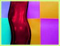
It seems a little hyper-saturated, which may have caused some graininess. Otherwise a very nice, interesting shot!
|
|
 Photographer found comment helpful. Photographer found comment helpful. |
|
|
05/08/2004 09:06:14 PM |
| Very cool...like the wild color of purple running throughout. great reflections and lines....nicely done |
|
| Photographer found comment helpful. |
|
|
05/08/2004 03:50:28 PM |
| I love warped reflections like this. There are a few bright spots that are a bit distracting, however the overall composition is well done and the exposure seems right. 7 |
|
| Photographer found comment helpful. |
|
|
05/07/2004 07:41:41 AM |
| Nicely done. Very abstract. I like it. |
|
| Photographer found comment helpful. |
|
|
05/05/2004 07:19:13 PM |
nice one - although i know what it is. colors, and composition are good.
good luck |
|
| Photographer found comment helpful. |
|
|
05/05/2004 02:59:35 PM |
I've got my eye on a few buildings like this!...
Fantastic distortion...I know some will say 'it's a building' and mark you down but not everyone can be as aesthetically well-endowed as us, can they? Top ranker |
|
| Photographer found comment helpful. |
|
|
05/04/2004 07:54:24 PM |
| Lovely, one could look at it for ages. |
|
| Photographer found comment helpful. |
|
|
05/04/2004 07:17:24 PM |
| Nice photo, one of my favorites so far in the abstracts. |
|
| Photographer found comment helpful. |
|
|
05/04/2004 06:38:00 PM |
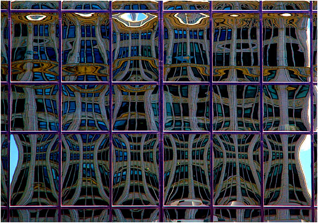
| Is it the window-panes distorting a building opposite. I hope so, otherwise my eyes are going. The whole thing looks like a wall of Art Nouveau tiles. Very good. |
|
| Photographer found comment helpful. |
|
|
05/03/2004 09:40:27 PM |
| Very nice abstract. Colors work very well together. The varying rectangle sizes not being consistent gives it a nice randomness. I wish all of the brightest areas were not so close to the outer edges, as they lead you out of the frame as is. The very narrow border on the outside tends to mitigate this though - although normally I'm not a big fan of borders. |
|
| Photographer found comment helpful. |
|
|
05/03/2004 07:49:15 PM |
| The lighter area's at the top bottom left & right hand side spoil this image for me. A slightly tighter crop would improve the image. Nice idea though. |
|
| Photographer found comment helpful. |
|
|
05/03/2004 12:42:13 PM |
|
| Photographer found comment helpful. |
|
|
05/03/2004 12:12:43 PM |
| Very well composed and a great concept. |
|
| Photographer found comment helpful. |
|
|
05/03/2004 10:24:49 AM |
| Very good catch.Very abstract. |
|
| Photographer found comment helpful. |
|
|
05/03/2004 07:56:21 AM |
| There is something very appealing about this - well spotted and a lovely crisp photo. Must ahve taken some care to get it square, an important element to contrast with the distortions. I also like the vertical asymmetry contrasting with the horizontal symmetry. This ought to be the winner - 10 |
|
| Photographer found comment helpful. |
|
|
05/03/2004 04:32:41 AM |
| Like this one. Meets the challenge well. |
|
| Photographer found comment helpful. |
|
|
05/03/2004 12:30:08 AM |
|
| Photographer found comment helpful. |
Home -
Challenges -
Community -
League -
Photos -
Cameras -
Lenses -
Learn -
Help -
Terms of Use -
Privacy -
Top ^
DPChallenge, and website content and design, Copyright © 2001-2025 Challenging Technologies, LLC.
All digital photo copyrights belong to the photographers and may not be used without permission.
Current Server Time: 03/12/2025 06:14:24 PM EDT.