| Author | Thread |
|
|
05/14/2004 12:07:33 PM |
Greetings from the Critique Club!
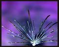
From your shower stall? Wow, I thought it was a tree knot! I really shoudn't be the one doing a critique on an abstract shot. It's not one of my better areas of photography and I honestly never really understood a lot of it. But here goes, so knowing what you do about my strength in this area, this isn't a bad shot to me overall but the whole shot seems to lack that POP, that WOW that really makes it jump out of the screen at me.
I like the composition and the cropping but the colors, while nice, seem a bit dull overall to me. Maybe if you played with it a bit in the colors or hue and saturation to make the colors really pop out? Also if focus was just a tad sharper to really bring out the lines and edges?
I really like some of your other shots, the hippo one was great and the Magic one is also great. Keep up the good work!
Good Luck In Future Challenges!
Deannda
DNeufer@stny.rr.com if you have any questions or want to discuss this further! |
|
 Photographer found comment helpful. Photographer found comment helpful. |
Comments Made During the Challenge  |
|
|
05/09/2004 11:07:55 PM |
| Stunning colors combinations. |
|
| Photographer found comment helpful. |
|
|
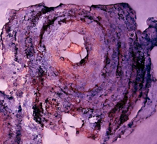
05/09/2004 02:23:40 AM |
| Almost looks like you had TWO rust shots.... assuming you entered the other... Well done nonetheless! |
|
| Photographer found comment helpful. |
|
|
05/07/2004 02:29:50 PM |
Composition: Subject Placement, Cropping, Background 9
Technical: Focus, Exposure, Lighting, Processing 8
Appeal: Is it Interesting, Motivating, Etc.? 9
How well does it meet the challenge: 10
Total Averaged Rating 9
one of my favorites this challenge |
|
| Photographer found comment helpful. |
|
|
05/06/2004 12:17:35 AM |
| Very interesting image. Great title too. |
|
| Photographer found comment helpful. |
|
|
05/04/2004 10:48:21 AM |
| This is very nice. Beautiful to the eyes. Give it an 8. |
|
| Photographer found comment helpful. |
|
|
05/03/2004 11:25:03 PM |
| Tree trunk? Good texture, odd colour. Seems to have an abundance of magenta. BUT that's fine. :-) |
|
| Photographer found comment helpful. |
|
|
05/03/2004 02:51:49 PM |
| Should have gone closer, to avoid all those edges. Would be better to just use the whole in the middle as compositional element and then the colorful structures around it, without the edges. |
|
| Photographer found comment helpful. |
|
|
05/03/2004 02:23:38 PM |
| My daughter's favorite color scheme, so it must be good. Whatever this is, a little sharper focus would have gotten a 9 rather than the 7 I am giving it. Despite the complaints, this is pleasing to the eye. |
|
| Photographer found comment helpful. |
|
|
05/03/2004 09:08:23 AM |
|
| Photographer found comment helpful. |
|
|
05/03/2004 12:43:51 AM |
| very nice- it reminds me of the album cover for Cat Power's "The Covers Record" |
|
| Photographer found comment helpful. |
|
|
05/03/2004 12:15:34 AM |
| Beautiful color. Very interesting subject as well. The instructions say it's all about lines, shapes, and colors, and you have that. |
|
| Photographer found comment helpful. |
Home -
Challenges -
Community -
League -
Photos -
Cameras -
Lenses -
Learn -
Help -
Terms of Use -
Privacy -
Top ^
DPChallenge, and website content and design, Copyright © 2001-2025 Challenging Technologies, LLC.
All digital photo copyrights belong to the photographers and may not be used without permission.
Current Server Time: 03/12/2025 03:34:53 PM EDT.