| Author | Thread |
Comments Made During the Challenge  |
|
|
10/27/2002 12:22:00 AM |
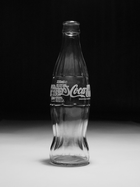
| I would have preferred to see the entire "Coca Cola" logo instead of only half plus that other text. Otherwise, nicely done photo. |
|
 Photographer found comment helpful. Photographer found comment helpful. |
|
|
10/24/2002 10:11:00 PM |
| don't care for the composition because the glass looks like a double exposure and the labels on top of each other distract from the picture. |
|
| Photographer found comment helpful. |
|
|
10/24/2002 07:35:00 PM |
| Good strong image, I like the way the edge of the light slants across the bottle. |
|
| Photographer found comment helpful. |
|
|
10/24/2002 08:46:00 AM |
| Does the bottle look better turned to get the 330ml to the back? Very well done, theres none of those over bright hilites that blemish other glass images. |
|
| Photographer found comment helpful. |
|
|
10/24/2002 12:24:00 AM |
| I think this is a really great photo but could have been done from a different angle great job still ! 9 smshats |
|
| Photographer found comment helpful. |
|
|
10/21/2002 09:16:00 AM |
| Interesting shot. I like how you have turned the bottle so that the coca-cola isn't straight on. |
|
| Photographer found comment helpful. |
|
|
10/21/2002 06:35:00 AM |
| Nice and simple. Might be slightly better if the bottle was off cent(er)re, but it's excellent regardless. seasick - 8. |
|
| Photographer found comment helpful. |
Home -
Challenges -
Community -
League -
Photos -
Cameras -
Lenses -
Learn -
Help -
Terms of Use -
Privacy -
Top ^
DPChallenge, and website content and design, Copyright © 2001-2025 Challenging Technologies, LLC.
All digital photo copyrights belong to the photographers and may not be used without permission.
Current Server Time: 03/14/2025 11:22:08 PM EDT.