| Author | Thread |
Comments Made During the Challenge  |
|
|
12/06/2008 12:18:15 PM |
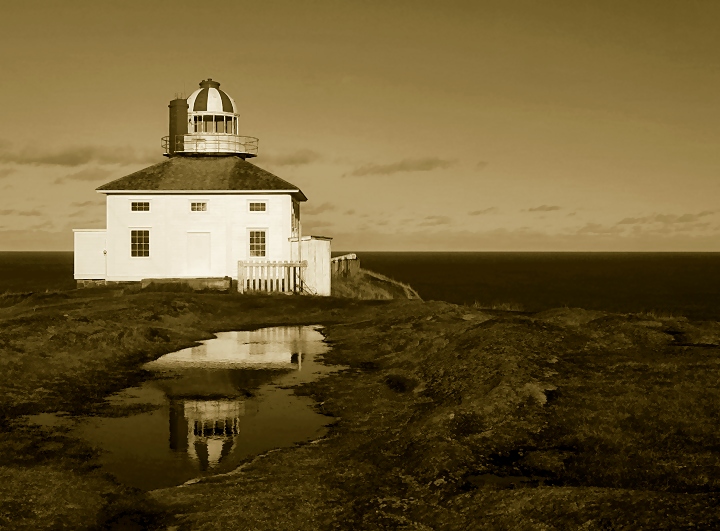
| I'm curious why, if you thought the reflection was the important part, there is so much nothing on the right side of the frame. Also, needs more contrast. Otherwise, a decent shot. |
|
 Photographer found comment helpful. Photographer found comment helpful. |
|
|
12/05/2008 09:39:53 AM |
| I don't care for the sepia in this. The reflection is placed nicely. |
|
| Photographer found comment helpful. |
|
|
12/04/2008 08:13:13 AM |
| Interesting view, the reflection is nice but I'm not so much a fan of the sepia(ish) toning |
|
| Photographer found comment helpful. |
|
|
12/02/2008 09:53:45 PM |
| Wow... I really like this composition and the sepia treatment. I'd have burned some of the side of the building to bring out a bit more of the details.. .but it's not a big deal. (not voting yet) |
|
| Photographer found comment helpful. |
|
|
12/01/2008 06:19:42 PM |
| The lighthouse's bulk and brightness tends to make this feel a bit stark. |
|
| Photographer found comment helpful. |
|
|
12/01/2008 02:58:08 AM |
| nice overall...the tint is OK, but I am not sure it's exactly right for this image...try a less central horizon next time as well |
|
| Photographer found comment helpful. |
|
|
12/01/2008 12:43:15 AM |
| Horizon is too straight. Just kidding. In fact it's laser perfect. |
|
| Photographer found comment helpful. |
Home -
Challenges -
Community -
League -
Photos -
Cameras -
Lenses -
Learn -
Help -
Terms of Use -
Privacy -
Top ^
DPChallenge, and website content and design, Copyright © 2001-2025 Challenging Technologies, LLC.
All digital photo copyrights belong to the photographers and may not be used without permission.
Current Server Time: 03/12/2025 02:22:24 AM EDT.