| Author | Thread |
Comments Made During the Challenge  |
|
|
05/11/2004 01:38:37 PM |
|
 Photographer found comment helpful. Photographer found comment helpful. |
|
|
05/10/2004 02:11:59 PM |
| very smart shot, i would have prefered a litlle more colour saturation. Great stuff |
|
| Photographer found comment helpful. |
|
|
05/09/2004 02:19:22 PM |
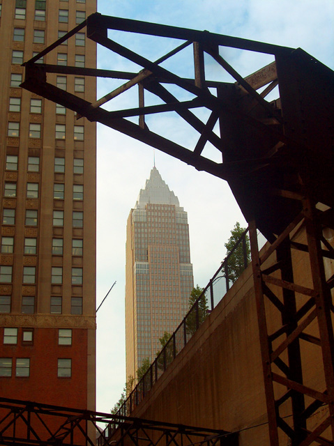
Excellent framing of Empire State Building which seems to disappear into a heavenly light. I would have preferred though that you would have used photoshop to make the lines near the left and right edges vertical. I feel like I am looking at the leaning tower of manhattan oon the right. Additional lighting on this side of the erector set would also help. Large expanses are only in silhouette.
A 6. |
|
| Photographer found comment helpful. |
|
|
05/09/2004 01:06:28 PM |
| I love the framing in this shot. 8. |
|
| Photographer found comment helpful. |
|
|
05/09/2004 10:04:19 AM |
Composition: Subject Placement, Cropping, Background 7
Technical: Focus, Exposure, Lighting, Processing 5
Appeal: Is it Interesting, Motivating, Etc.? 7
How well does it meet the challenge: 5
Total Averaged Rating 6.00 Dick
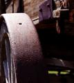
The underexposure of the structure loses its impact as a rusted main subject, I am drawn to the building in the back. |
|
| Photographer found comment helpful. |
|
|
05/08/2004 06:57:53 AM |
| I love the photo, but docked a few points because the building in center came off as the subject to me, not the actual rusted object which was kind of what the challenge was about. =) |
|
| Photographer found comment helpful. |
|
|
05/07/2004 08:56:05 AM |
| I like the contrast of this shot. Nice colors, not too sharp, but just sharp enough. Well done. 9 |
|
| Photographer found comment helpful. |
|
|
05/06/2004 09:32:55 PM |
Composition: Subject Placement, Cropping, Background 6
Technical: Focus, Exposure, Lighting, Processing 6
Appeal: Is it Interesting, Motivating, Etc. 4
How well does it meet the challenge: 6
Total Averaged Rating(Rounded) 6
|
|
| Photographer found comment helpful. |
|
|
05/06/2004 08:22:05 PM |
| Good contrast of new and old. The backlight of the "erector set" takes away from the photograph. |
|
| Photographer found comment helpful. |
|
|
05/06/2004 01:49:56 PM |
| Nice with a different composition. Too bad about the fog/smog/whatever that makes the building faded. Would have been a nice one in the silhouettes challenge too. |
|
| Photographer found comment helpful. |
|
|
05/06/2004 04:53:03 AM |
Nicely framed, but the rust is hard to see.
David |
|
| Photographer found comment helpful. |
|
|
05/05/2004 06:18:13 PM |
| you should have exposed for the rust there is little detail here. Although I like the contrast of new old and composition |
|
| Photographer found comment helpful. |
|
|
05/05/2004 05:20:14 PM |
| I think the subject is a little too dark, I like the background though, Good luck :) |
|
| Photographer found comment helpful. |
|
|
05/05/2004 03:36:27 PM |
| A fellow Clevelander. Great shot, nicely framed and nice contrast. It's a shame the foreground shadows hide the details of the rust. I imagine you'll receive comments to that effect. 7 |
|
| Photographer found comment helpful. |
|
|
05/05/2004 02:32:11 PM |
| your main subject is too dark, a little fill flash would have made this an 8. instead i give you a 6 |
|
| Photographer found comment helpful. |
|
|
05/05/2004 12:40:07 PM |
| Change the angle just a tad so that the antenna from the building doesn't go into the 'erector set' |
|
| Photographer found comment helpful. |
Home -
Challenges -
Community -
League -
Photos -
Cameras -
Lenses -
Learn -
Help -
Terms of Use -
Privacy -
Top ^
DPChallenge, and website content and design, Copyright © 2001-2025 Challenging Technologies, LLC.
All digital photo copyrights belong to the photographers and may not be used without permission.
Current Server Time: 03/11/2025 02:10:20 PM EDT.