| Author | Thread |
|
|
05/21/2005 11:17:18 PM |
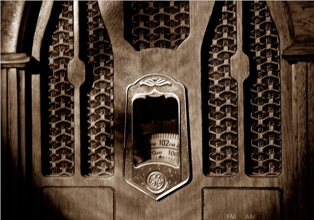
| Creative and interesting in a good way selection. may have been better with a background. suggest positioning this subject against a modern techno-backdrop as a contrast (old v. new) and work on dof & focus. i don't like the sepia on this subject. the round black corners distract. I'd be interested in this photo for my gallery if you take my suggestion especially finding a contrasting background and leaving the radio in b/w against a color background. a visibly steaming cup of coffee (or any liquid prucing steam) positioned adjacent to the radio would be a perfect touch and would fit what I am looking for to purchase. contact me if interest. CMKStudio |
|
Comments Made During the Challenge  |
|
|
05/16/2004 04:09:30 AM |
| The sepia works well with this. |
|
 Photographer found comment helpful. Photographer found comment helpful. |
|
|
05/15/2004 10:04:29 PM |
| Interesting subject but enough out of focus as to really undermine the image. |
|
| Photographer found comment helpful. |
|
|
05/15/2004 05:58:38 PM |
| I like the shadows on the radio here... especially the symmetry of it. |
|
| Photographer found comment helpful. |
|
|
05/14/2004 08:50:17 PM |
| Too bad that dial is out of focus. Nice lighting and good tones throughout image. |
|
| Photographer found comment helpful. |
|
|
05/14/2004 06:43:04 PM |
| The black spots in the bottom corners is really distracting. Were you looking through a hole or something? Perhaps a tighter crop or a different angle would help. There's also a shadow running diagonal down the photo from the center top to the mid left. I like the oclor, but the contrast & clarity could be higher. |
|
| Photographer found comment helpful. |
|
|
05/13/2004 09:29:22 AM |
| I like the sepia a lot, but the image is very out of focus. Also, I'm not sure about the lighting. The dark bottom corners bother me. |
|
| Photographer found comment helpful. |
|
|
05/13/2004 12:45:45 AM |
|
|
|
05/12/2004 06:34:35 PM |
| Subject is blurry. Either lens has severe vignetting issues or just odd lighting. The duotone works well to depict age. |
|
| Photographer found comment helpful. |
|
|
05/12/2004 12:42:09 PM |
| Not at all a bad photo, it could use just a bit more depth of field. |
|
| Photographer found comment helpful. |
|
|
05/12/2004 12:37:39 PM |
| Beautiful shot. I love the texture of the wood and the way the light falls off around the corners. Definately a 10! |
|
| Photographer found comment helpful. |
|
|
05/12/2004 04:49:18 AM |
| i don't want to step on photographic intentions - but i don't see anything in sharp focus - may i suggest a clearer focul point? preferably sharper focus on the 'objects' in the middle of the frame. |
|
| Photographer found comment helpful. |
|
|
05/12/2004 01:13:24 AM |
|
|
|
05/11/2004 04:19:57 PM |
| I can almost hear Jack Benny now. I like your vignette presentation too. 8 danny |
|
| Photographer found comment helpful. |
|
|
05/11/2004 04:01:07 PM |
| If only the dial wa sin focus |
|
| Photographer found comment helpful. |
|
|
05/11/2004 03:04:11 PM |
| This is a very interesting image, and I like the overall sharpness you've achieved. The vignetting in the lower left and right corners is bothersome, though. |
|
| Photographer found comment helpful. |
|
|
05/10/2004 08:29:55 PM |
Decent photo, the vignetting is a nice touch.
Incidently, I collect old radios. This replica is one of the more faithful. |
|
| Photographer found comment helpful. |
|
|
05/10/2004 08:08:01 PM |
| I think that the focus should have been sharpest on the numbers rather than on a plane slightly in front of the radio...or you can try different depth of fields... |
|
| Photographer found comment helpful. |
|
|
05/10/2004 05:40:58 PM |
| I like the nostalgic feel lent by the shadows. Wish the radio was in sharper focus, |
|
| Photographer found comment helpful. |
|
|
05/10/2004 09:50:07 AM |
| Would have been nicer with a larger DOF to have the dial also in focus. Nice effect with the sepia. |
|
| Photographer found comment helpful. |
|
|
05/10/2004 04:48:58 AM |
|
| Photographer found comment helpful. |
|
|
05/10/2004 02:30:28 AM |
| Fantastic old radio, sepia really works with this picture. The focus seems just a bit off. |
|
| Photographer found comment helpful. |
|
|
05/10/2004 01:19:17 AM |
|
| Photographer found comment helpful. |
|
|
05/10/2004 01:08:46 AM |
| Nice toning but it looks out of focus, possibly due to low light. The shadows in the corners dont really help much either. |
|
| Photographer found comment helpful. |
|
|
05/10/2004 12:24:23 AM |
| what a great look..take something you might not have given a second look too and gave it a really creative look..good luck :) |
|
| Photographer found comment helpful. |
Home -
Challenges -
Community -
League -
Photos -
Cameras -
Lenses -
Learn -
Help -
Terms of Use -
Privacy -
Top ^
DPChallenge, and website content and design, Copyright © 2001-2025 Challenging Technologies, LLC.
All digital photo copyrights belong to the photographers and may not be used without permission.
Current Server Time: 03/12/2025 02:11:12 AM EDT.