| Author | Thread |
|
|
05/28/2004 03:48:31 PM |
Originally posted by BruB:
This photo doesn't capture the idea of the passed challenge in an interesting way. There isn't anything of actual visual appeal about it, so a close up shot of it doesn't make for a dynamic photo. |
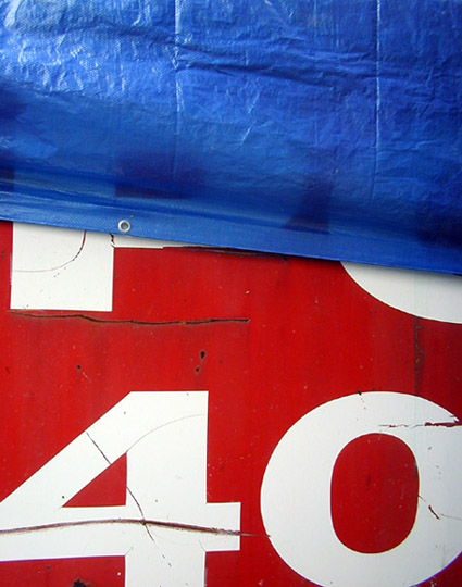
Whether or not this photo has visual appeal is a matter of taste.I liked the bold colors and the graphic interest of the number 40. Both my husband and my daughter saw this at separate times and spontaneously reacted with, "Cool!" I'm not saying it is an amazing photo I just don't think that it can be so easily dismissed as having no visual appeal. Perhaps not to you but it obviously had appeal for me because I made the picture. Some people made good points about there not being a subject and I'll give them that. To me the subject was the color scheme. I don't think an image always has to be literal; this is a tree, this is a bird, this is a fly, this is a birthday party, etc.. Sometimes it is about discovering pleasing colors, shapes, and design in the mundane. The challenge was to photograph something one has never photographer before in a location one has never made photographs before. It certainly qualified in that respect. To me, it shows a new way of viewing the mundane or thinking outside the box. The number 40 can actually have quite a bit of significance that doesn't require me to point out for the observer. |
|
|
|
05/22/2004 07:25:38 AM |
| This photo doesn't capture the idea of the passed challenge in an interesting way. There isn't anything of actual visual appeal about it, so a close up shot of it doesn't make for a dynamic photo. |
|
Comments Made During the Challenge  |
|
|
05/16/2004 08:58:42 PM |
| the colors are very good in this and there are some nice texture constrasts...but what is your subject, 40, painted numbers, well what is it on....The blue appears to be a tarp of some sort...I think it might have been better pulling back so the '40' was not chooped off and leave some more room at the bottom. Interesting patriotic color scheme but not much else going for it for me. |
|
 Photographer found comment helpful. Photographer found comment helpful. |
|
|
05/16/2004 07:54:43 PM |
Composition: (Subject Placement, Cropping, Background): 6
Technical: (Focus, Exposure, Lighting, Processing): 5
Appeal: (Is it Interesting, Motivating, etc.): 4
Challenge: (How well it meets the challenge):5
Average (rounded): 5
|
|
| Photographer found comment helpful. |
|
|
05/16/2004 02:53:36 PM |
| Good color combination with the red, white, and blue, and an interesting blend of textures between the tarp and whatever material the red is (looks kinda like metal). The subject doesnt really do much for me, though, sorry. |
|
| Photographer found comment helpful. |
|
|
05/15/2004 03:12:08 PM |
| Pretty nice abstract...colors are deep and saturated nicely |
|
| Photographer found comment helpful. |
|
|
05/14/2004 02:28:01 PM |
| Not sure what your trying to show with this shot. Sorry it's not interesting. ? |
|
| Photographer found comment helpful. |
|
|
05/12/2004 04:35:00 PM |
| Well i like the colors but I just don't get what I am looking at. |
|
| Photographer found comment helpful. |
|
|
05/11/2004 08:31:51 PM |
| Interesting subject to say the least. Very patriotic colors. Good details on the tarp and nice contrast. Overall, image seems to have been slightly oversharpened but it's not distracting. 7 |
|
| Photographer found comment helpful. |
|
|
05/11/2004 05:06:01 PM |
| Excellent contrasting textures and colors. Very strong vivid image. 8 |
|
| Photographer found comment helpful. |
|
|
05/11/2004 01:41:00 PM |
| Interesting concept. Overcropping the 40 works well with this image. Red and blue are always good colors in photography. Overall the image appears to be slightly soft focused to my taste and reduces its technical merit for me. There is nothing special about the lighting either. If possible, taking the shot from much further to the left or right to change the perspective and point of view would improve this image immensely. In that case shallow DOF might also be good, but I am unsure of that. Esthetics is important too. This image leaves the viewer asking, "What is the significance of the 40?" but does not provide an answer or make it seem more mysterious which would make it more interesting. Rating - 5 |
|
| Photographer found comment helpful. |
Home -
Challenges -
Community -
League -
Photos -
Cameras -
Lenses -
Learn -
Help -
Terms of Use -
Privacy -
Top ^
DPChallenge, and website content and design, Copyright © 2001-2025 Challenging Technologies, LLC.
All digital photo copyrights belong to the photographers and may not be used without permission.
Current Server Time: 03/12/2025 08:33:40 PM EDT.