| Author | Thread |
|
|
12/29/2008 03:17:29 PM |
 PostLuminous Award Nominee! PostLuminous Award Nominee!
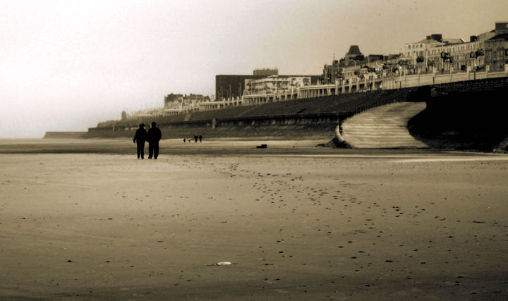
wonderful in every way--tone, composition, light, mood. Sepia is controlled well, here--just right for the mood, but not too much so that the image still communicates the cold at the scene. |
|
 Photographer found comment helpful. Photographer found comment helpful. |
|
|
12/29/2008 10:05:16 AM |
Originally posted by keegbow:
This image should ahve finished higher IMO. One of the few 10s I gave out, keep up the beautiful work. |
Thank you very much - that means a lot!
I'm just happy that a small amount of people found it as beautiful as I did.
I appreciate all of the comments - thank you! |
|
|
|
12/29/2008 12:15:36 AM |
| This image should ahve finished higher IMO. One of the few 10s I gave out, keep up the beautiful work. |
|
| Photographer found comment helpful. |
Comments Made During the Challenge  |
|
|
12/28/2008 12:57:22 PM |
| Beautifully composed and captured. Nice tones too. |
|
| Photographer found comment helpful. |
|
|
12/27/2008 04:24:38 PM |
|
| Photographer found comment helpful. |
|
|
12/27/2008 11:23:15 AM |
| nice shot, but is has to much foreground...tighter crop on the bottom... |
|
| Photographer found comment helpful. |
|
|
12/24/2008 01:59:11 PM |
| A little grainy but a nice concept. |
|
| Photographer found comment helpful. |
|
|
12/23/2008 04:11:14 PM |
| On my monitor this images is weirdly stretched out. I don't know if that was intentional, but the distortion really wrecks an otherwise great shot. Where is this? |
|
| Photographer found comment helpful. |
|
|
12/23/2008 03:39:17 AM |
| a very intriguing image with a lot of appeal. I like the concept for the challenge and the sepia tones work well for this image which adds the nostalgic feel. |
|
| Photographer found comment helpful. |
|
|
12/22/2008 07:57:00 AM |
|
| Photographer found comment helpful. |
|
|
12/22/2008 01:27:54 AM |
| This is gorgeous. I love the sepia treatment, and I'm not always crazy for sepia. I'd suggest perhaps not putting the horizon in the center of the frame, but I'm not sure I'd like more or less of the sand in the foreground. Perfect for the challenge too. |
|
| Photographer found comment helpful. |
|
|
12/22/2008 12:20:56 AM |
| Nice concept. I think if the couple had been sillouted ( is that how you spell it? ) against the white sky it would be far far better, as it stands your eye does not go straight to them. |
|
| Photographer found comment helpful. |
|
|
12/22/2008 12:03:18 AM |
| A little soft and the sky looks a little grainy, but it's still pleasing. |
|
| Photographer found comment helpful. |
Home -
Challenges -
Community -
League -
Photos -
Cameras -
Lenses -
Learn -
Help -
Terms of Use -
Privacy -
Top ^
DPChallenge, and website content and design, Copyright © 2001-2025 Challenging Technologies, LLC.
All digital photo copyrights belong to the photographers and may not be used without permission.
Current Server Time: 03/15/2025 06:45:07 PM EDT.