| Author | Thread |
|
|
01/13/2009 09:35:25 PM |
Critique Club
Initial impression: classic subject
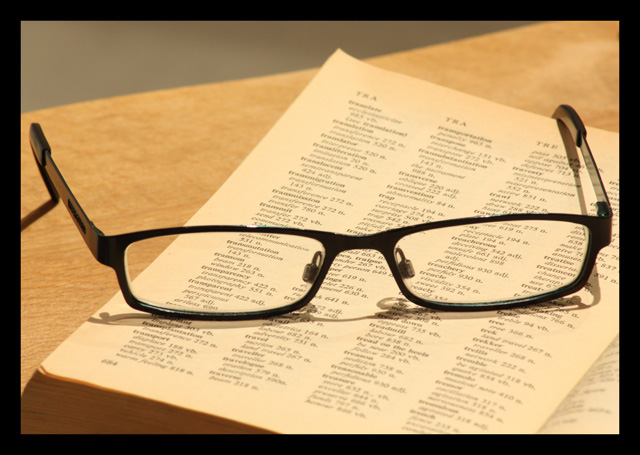
Composition: Simple, which I think often works well. An angular presentation of the glasses would likely add to the visual interest. Particularly if it were in parallel with the edge of the table, creating three sections to the photograph. I think this is the main component that would add to visual impact and interest.
Color is fine, WB appears to be fine as well. Lighting works, but is a bit dull in that it is not adding to the emotion or supporting the subject.
Subject is on point for the challenge, I think the composition and lighting kept the score on the lower end. Still life is difficult, particularly for me! Congrats on the camera. I really like your onion shot on your flickr page. That's the kind of lighting that would have added to this image. If you are interested, I just finished a great book on composition that you may enjoy. PM me and I'll send a link.
Cheers,
Ben |
|
 Photographer found comment helpful. Photographer found comment helpful. |
Comments Made During the Challenge  |
|
|
01/06/2009 03:58:19 PM |
| Like the idea.. Could you have made only "transparency legible" (possible with the equipment and the setting?).. |
|
|
|
01/06/2009 10:10:37 AM |
|
|
|
01/05/2009 08:29:30 PM |
|
|
|
01/04/2009 09:25:21 PM |
| I like it, clean and simple |
|
| Photographer found comment helpful. |
|
|
12/31/2008 08:19:05 PM |
| A popular set-up. Lighting is a bit flat though. |
|
| Photographer found comment helpful. |
Home -
Challenges -
Community -
League -
Photos -
Cameras -
Lenses -
Learn -
Help -
Terms of Use -
Privacy -
Top ^
DPChallenge, and website content and design, Copyright © 2001-2025 Challenging Technologies, LLC.
All digital photo copyrights belong to the photographers and may not be used without permission.
Current Server Time: 03/14/2025 06:28:53 AM EDT.